A Collection of My Work
I've professionally been designing for over six years. Creating meaningful and experience driven design solutions has been my focus. My background is in Product Design but recently I've been concentrating on Graphic Design. I have a very technical and empathetic approach to design, always seeking aesthetic excellence. As a true passionate designer, I hereby pledge to help continue the fight against global ugliness.
About Me
I hold a BFA in Industrial Design from the College for Creative Studies (CCS) in Detroit, MI. I graduated in May 2004 and started working for Hewlett-Packard's notebook design organization in November of the same year. I stayed at that job for almost 6 years, which is an eternity in the product design world, but it was a great job to start off my design career with. The opportunities that HP presented me with while I was there were almost surreal. I was able to lead the design language's for two separate model series of the Compaq notebook line (V & CQ Series); Share the lead for the design language for one model series of the HP notebook line (dv Series); And lead the design language for one model series of the HP notebook line (Envy Series).
Most of the products that I had a hand in designing were for mass production, not as large as the cell phone industry, but of pretty decent proportions. A couple of hundred thousand on the low end to some multi-millions worth of units on the other. So the understanding of designing for the masses has had a large impact on my process for design thinking.
There was also a steady amount of international travel while working for HP as well. The most regular destinations were to Taipei - Taiwan, Shanghai - China and my personal favorite Kyoto - Japan. This travel has had an irreversible effect on my life as a designer. Seeing and experiencing different cultures has helped shape but also broaden my understanding of designing for humanity.
After leaving HP, I decided to go back to school. I enrolled January 2011 in a Graphic Design course at the Shillington School in NYC.
You can also check out my Product Design Portfolio at www.coroflot.com/gruh_loo_skee
Experience
Graphic Design Internship
Boy Burns Barn / New York City / October 2011 - Jan 2012
As an intern for the boutique graphic design company BBB, my roles and responsibilities were to assist the owner / lead designer with graphic concepts and aesthetic execution. There was also much collaboration with another intern in which we would periodically brainstorm and share concepts and ideas. The project list for the three month period includes Richard Blais' restaurant branding of The Spence, Tisch School of the Arts Gala 2012 invitation, Redken holiday cards, Nylon Guys periodical illustrations and custom packaging design for Trail Rail.
Workshop Internship
Best Made Company / New York City / October 2011 - Jan 2012
For this internship, I worked closely with the BMC staff to develop and produce Best Made products. My responsibilities were to lead all aspects of the in-house custom axe production. The process and procedures included taking customer orders, crafting and executing impeccable paint schemes, and completing the packaging required for the overall enhanced product experience.This opportunity allowed my virtues as a craftsman to unfold and develop. Also assessing first hand the qualitative nature of BMC provided me with a greater understanding of design, branding and business.
Graphic Designer
Self Employed / New York City / April 2011 - present
As a freelance graphic designer I have worked on a variety of projects. From logo designs and small business branding to posters and event program layouts. I really enjoy collaborating with clients; everyone has different project requirements, objectives, personalities and taste which allows for endless design possibilities. Clients included Parea Bistro Restaurant, Giella Design Group, Natural Gourmet Institute, Ervin Stellar, Rewarding Achievement (REACH) and of coarse the arch enemies of all graphic designers, our friends and family.
Senior Industrial Designer
Hewlett Packard / Houston, Texas / November 2004 - July 2010
As an industrial designer in the consumer laptop organization, I was responsible for concepting, designing and innovating HP, HP Envy and Compaq branded computers for a global audience. From concept through production, I managed high volume projects while communicating with cross functional teams to deliver strategy, style and quality. Not only was I required to have aesthetic appreciation but engineering comprehension was a must as well. This position also required regular international travel to parts of Asia and when needed, I also assumed CMF roles and responsibilities.
Education
Certificate of Completion Graphic Design
Shillington School / New York, NY / April 2011
BFA Industrial Design
College for Creative Studies / Detroit, MI / May 2004
Awards
iF Design Award 2010 - HP Envy 13
Computer Shopper, Editor’s Choice Award 2009 - HP Envy 13
PC World, Best 100 Products of 2009 - HP Envy 13
CES Innovation Honoree 2008 - HP HDX Dragon
reddot design award 2007 - Compaq V3000
Etc.
I know Windows but prefer Mac. I’m proficient in Illustrator, Indesign, Photoshop and some Rhino. Other items I’m familiar with are Trend Analysis, Color Materials and Finish, Craftsmenship, Problem Solving and Sketching.
Contact Me
If you are inquiring about my services or maybe you just want to say hello, please fill out the information below. I will try and respond as quickly as Adamly possible.
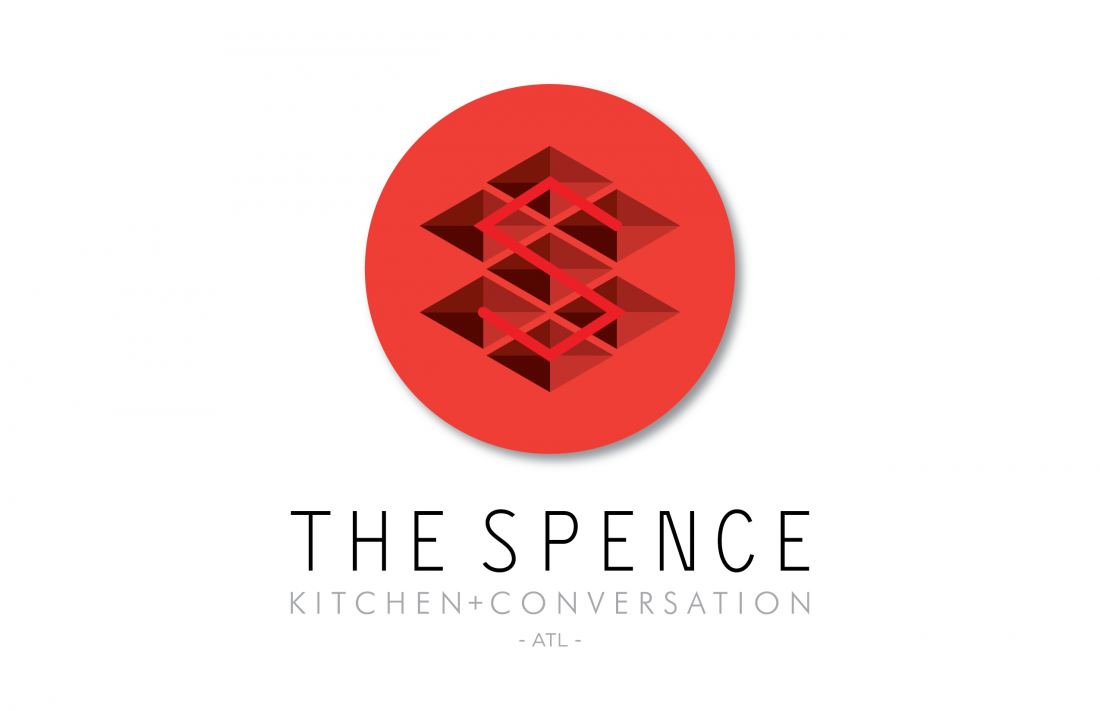
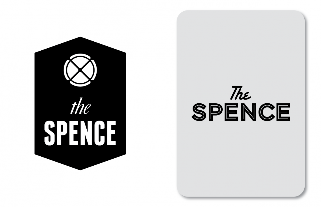
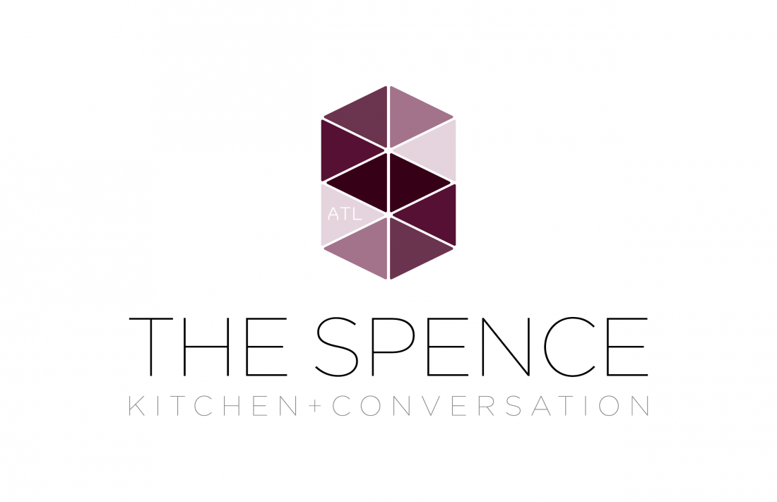
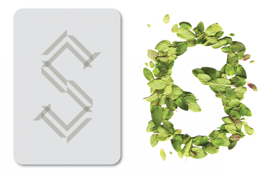
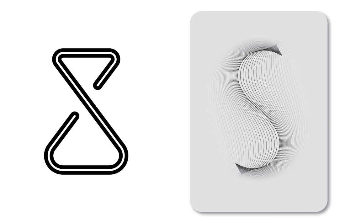
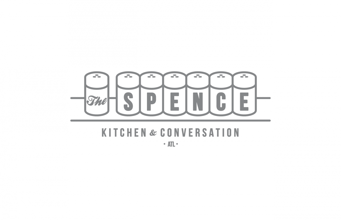
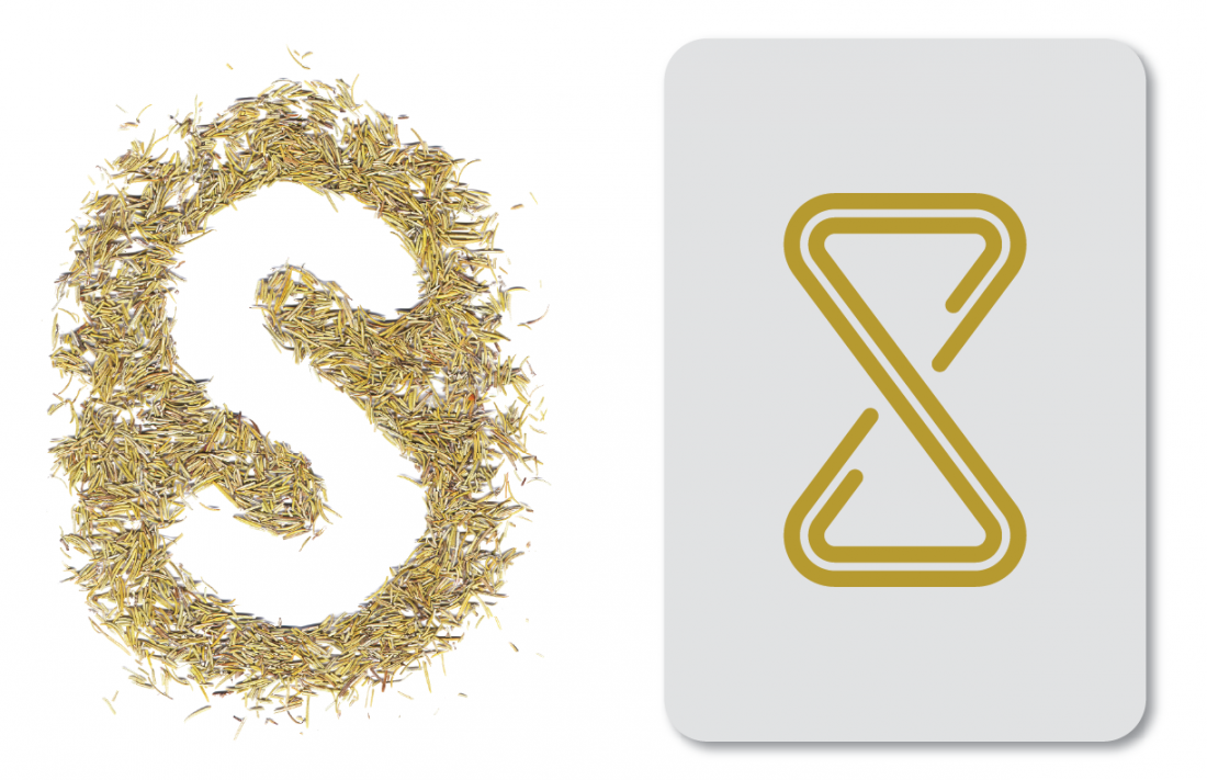
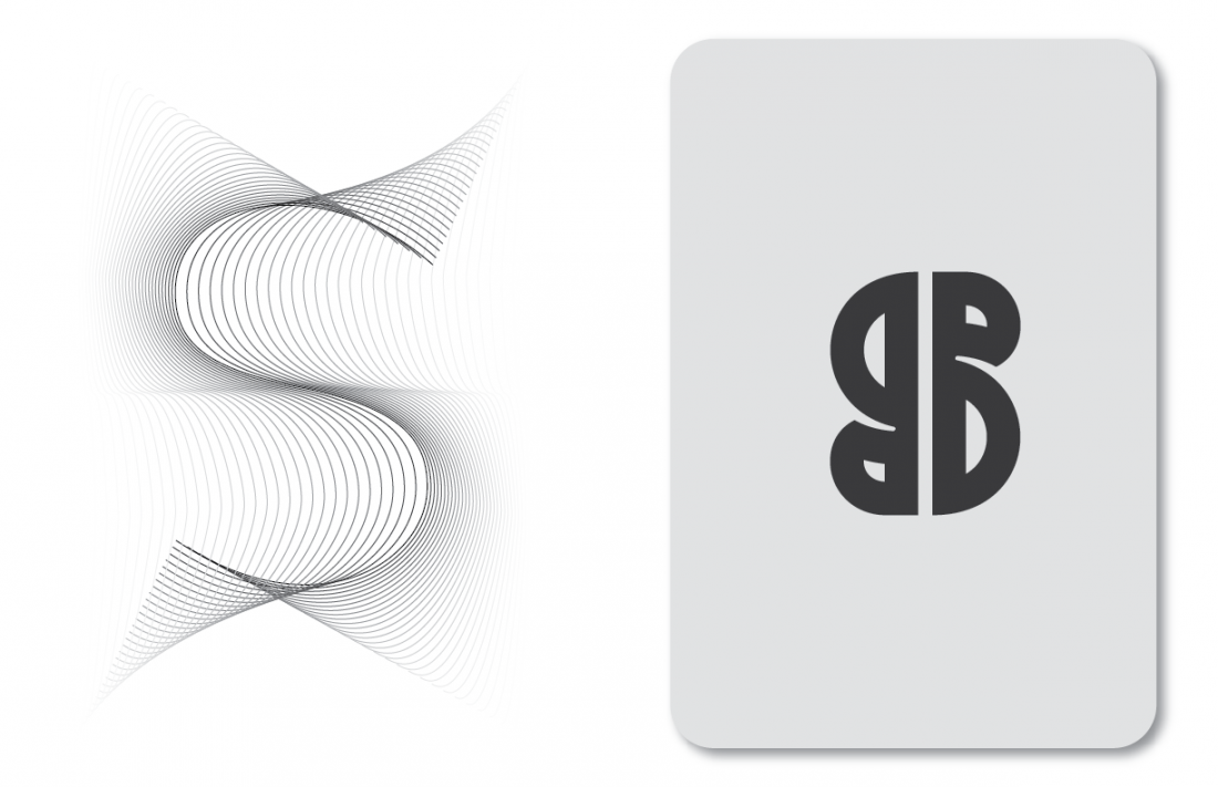
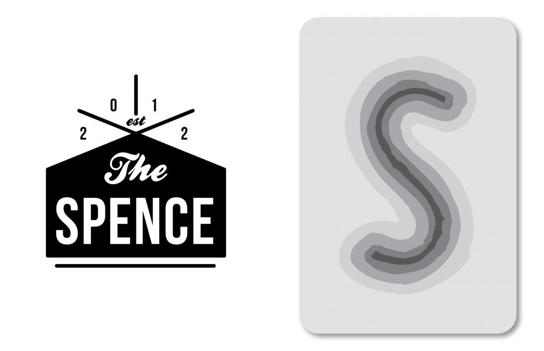
Restaurant Branding / The Spence
Boy Burns Barn Internship Project
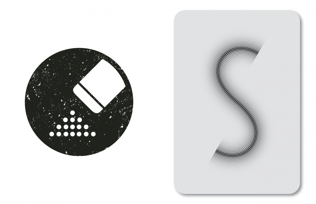
The Spence - A Richard Blais restaurant soon to be opened in Atlanta, GA. I believe the name is Scottish slang for a dispensary or pantry where food is stored. Mr. Blais, who is well known for modern cooking techniques such as Molecular Gastronomy, wanted to move beyond the cooking style others associate him with. This time, he is pursuing a no gimmicks no frills concept. This restaurant is about a man who just loves to cook. The idea is roughly community around the kitchen, or Kitchen + Conversation.
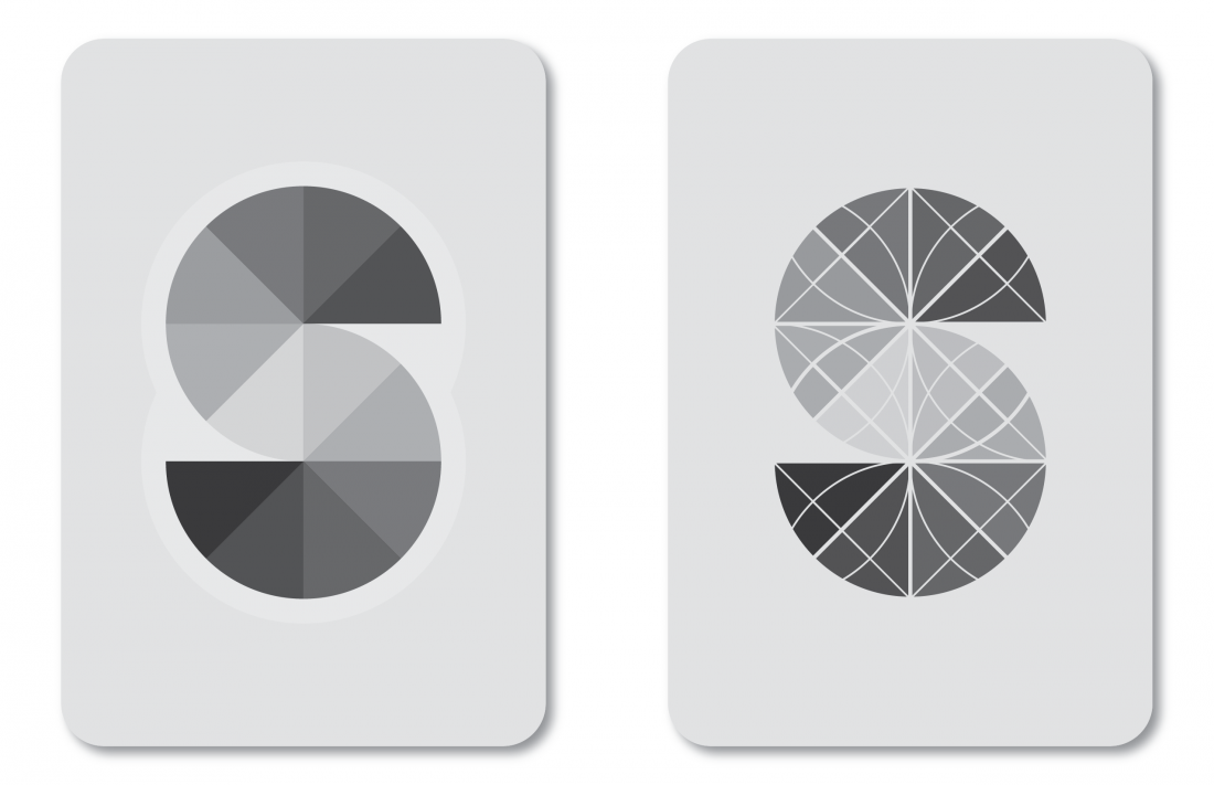
For this project I was tasked to explore typographic studies of the letter 'S'. Besides using my clean vector line aesthetic for the project, I decided to branch out of my comfort zone a bit and create some hand made letters using real ingredients such as peppermint leaves, rosemary, salt and peppercorns.
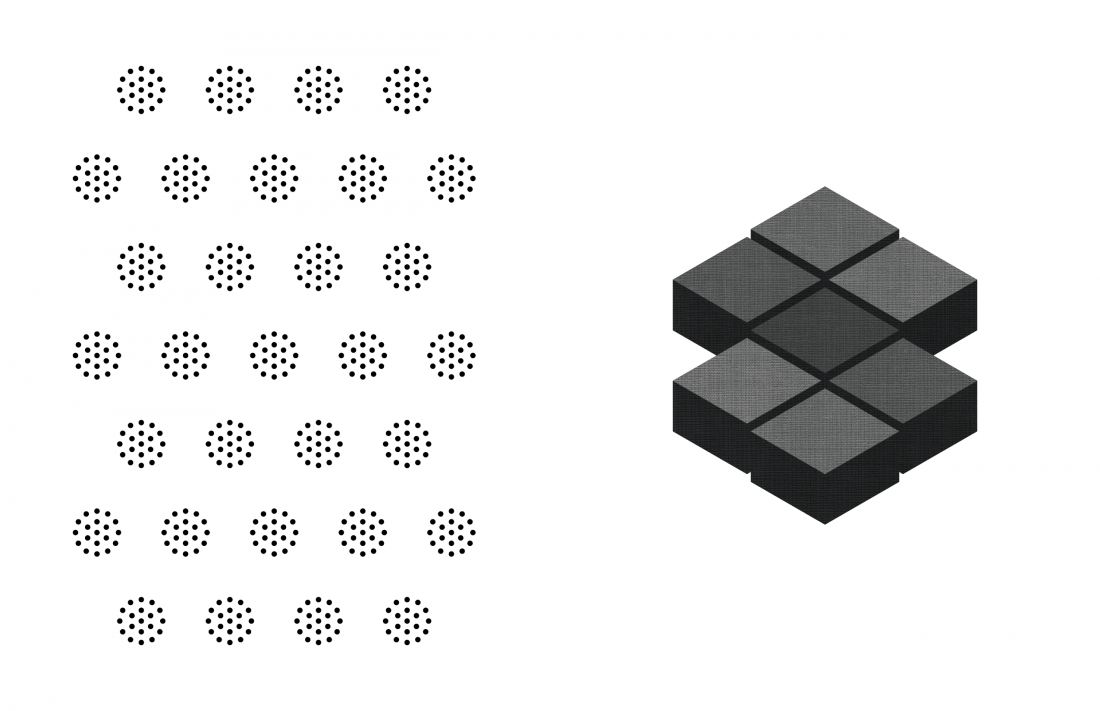
Logo Studies / The Spence / BBB Internship Project
Logo Study / The Spence / BBB Internship Project
Pattern & Logo Study / The Spence / BBB Internship Project
Logo Studies / The Spence / BBB Internship Project
Logo Study / The Spence / BBB Internship Project
Logo Color Study / The Spence / BBB Internship Project
Logo Studies / The Spence / BBB Internship Project
Logo Studies / The Spence / BBB Internship Project
Graphic & Logo Study / The Spence / BBB Internship Project
Logo Study / The Spence / BBB Internship Project
Logo Studies / The Spence / BBB Internship Project
Logo Studies / The Spence / BBB Internship Project
Logo Study / The Spence / BBB Internship Project
Logo Studies / The Spence / BBB Internship Project
Logo Studies / The Spence / BBB Internship Project
Logo Studies / The Spence / BBB Internship Project
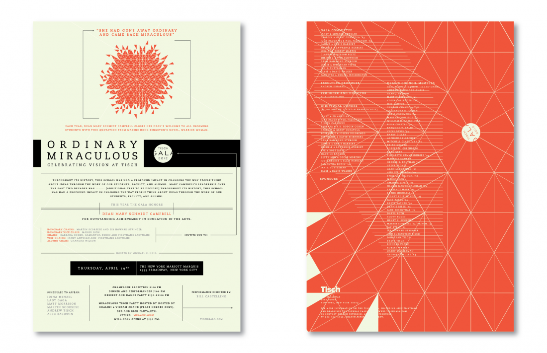
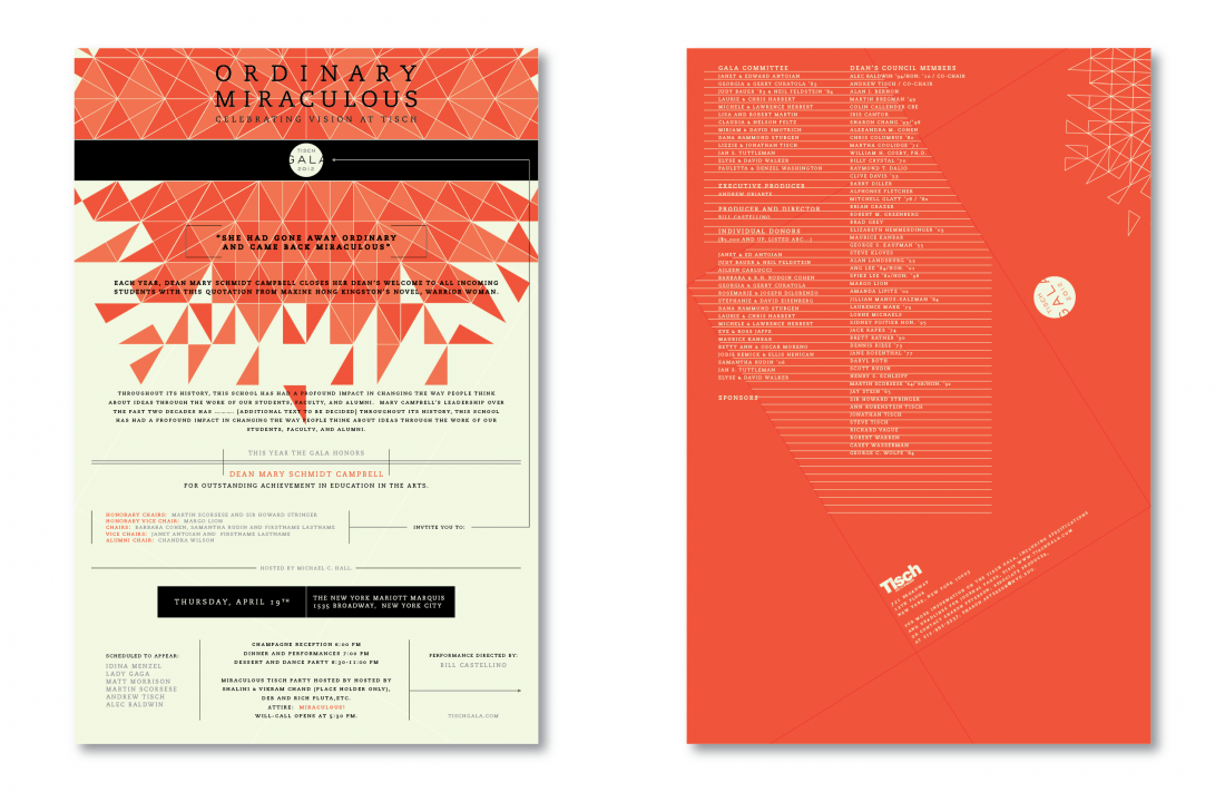
Gala Invitation / Tisch School of the Arts
Boy Burns Barn Internship Project
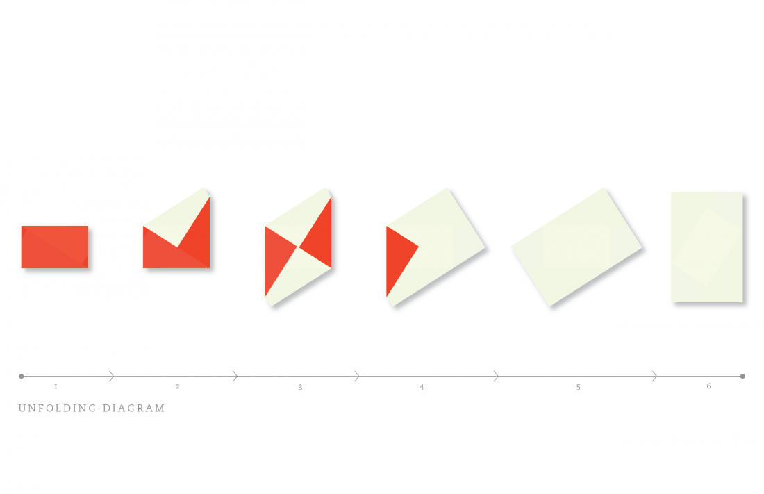
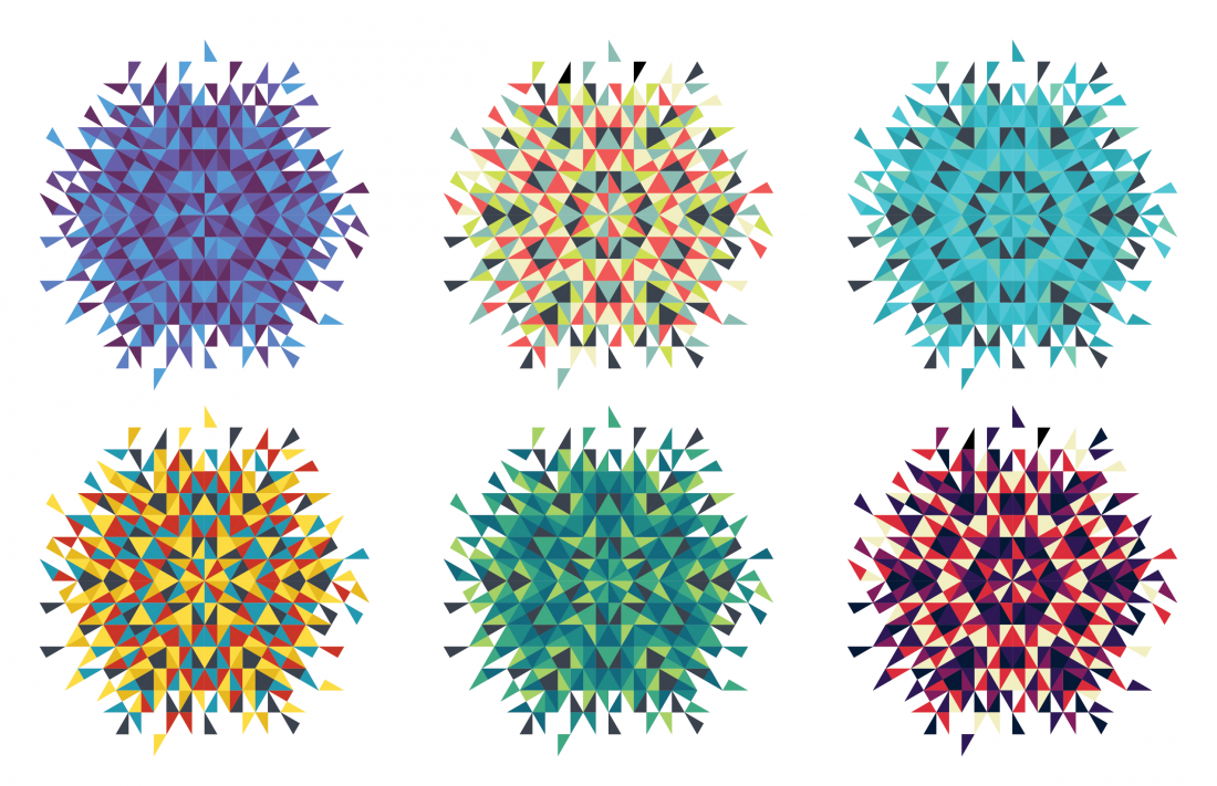
Ordinary Miraculous. These words were this year's theme for celebrating vision at Tisch. The leading idea solving the theme's visual difficulty, credited to the other BBB intern, was a kaleidoscope. The kaleidoscope, essentially a single object reflected many times over to create wonderfully unique patterns, symbolizes the theme Ordinary Miraculous quite well. My role was to create an aesthetically pleasing and printable kaleidoscope graphic. I also worked out a unique folding design for a posteresque invite. This however, was not the primary direction for the final invite.
Kaleidoscope Graphic / Tisch / BBB Internship Project
Poster Concept / Tisch / BBB Internship Project
Poster Concept / Tisch / BBB Internship Project
Poster Unfolding Diagram / Tisch / BBB Internship Project
Kaleidoscope Color Studies / Tisch / BBB Internship Project
Kaleidoscope Graphic Concept / Tisch / BBB Internship Project
City Graphic Concept / Tisch / BBB Internship Project
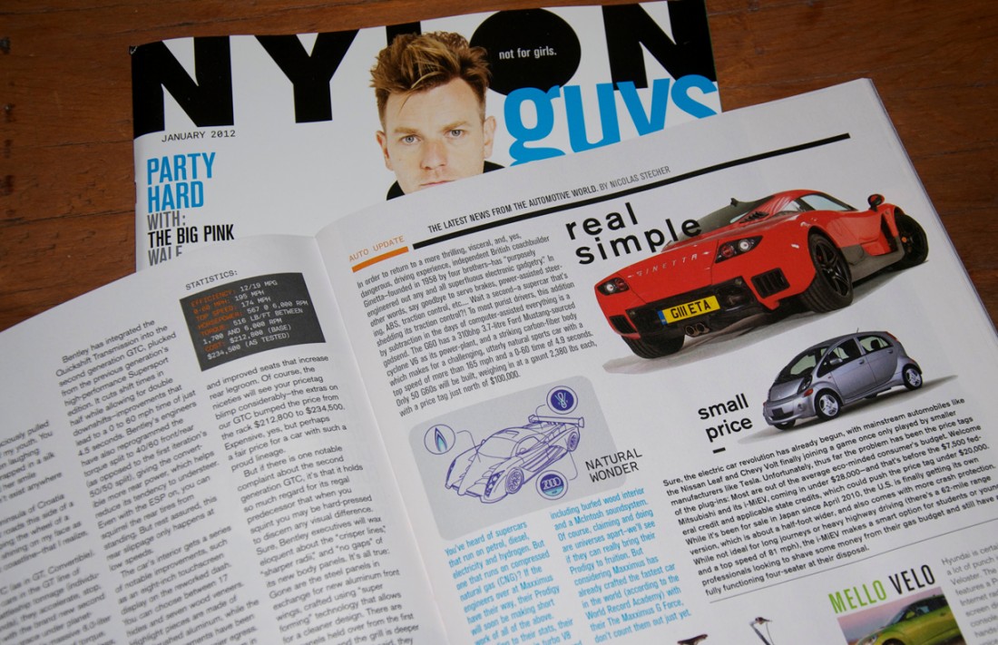
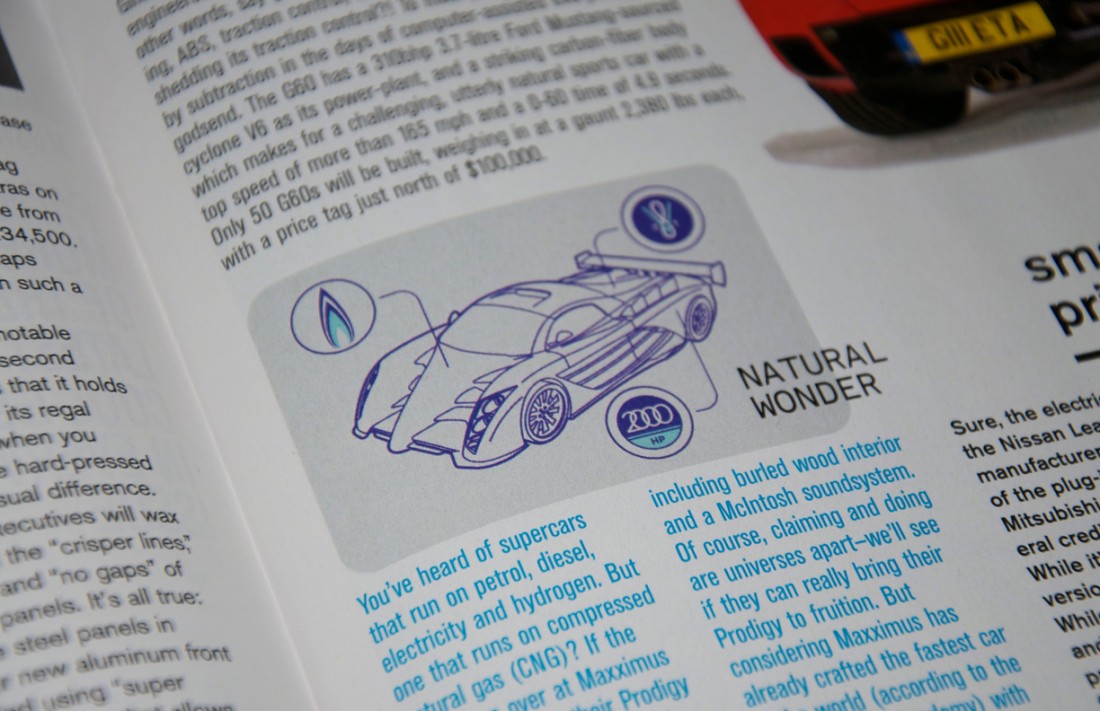
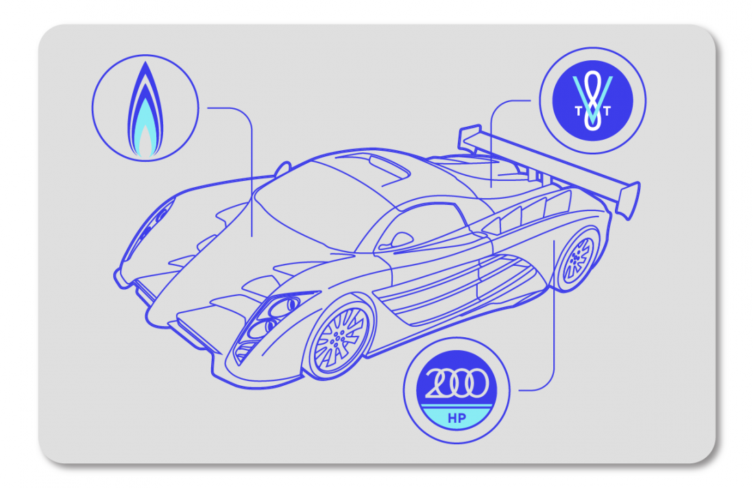
Periodical Illustrations / Nylon Guys
Boy Burns Barn Internship Project
Maxximus Prodigy Supercar - This illustration was a line drawing I created over the top of an existing rendering of the supercar. Because the article boasts this vehicle running on natural gas, I created addition graphics to accompany its most notable attributes.
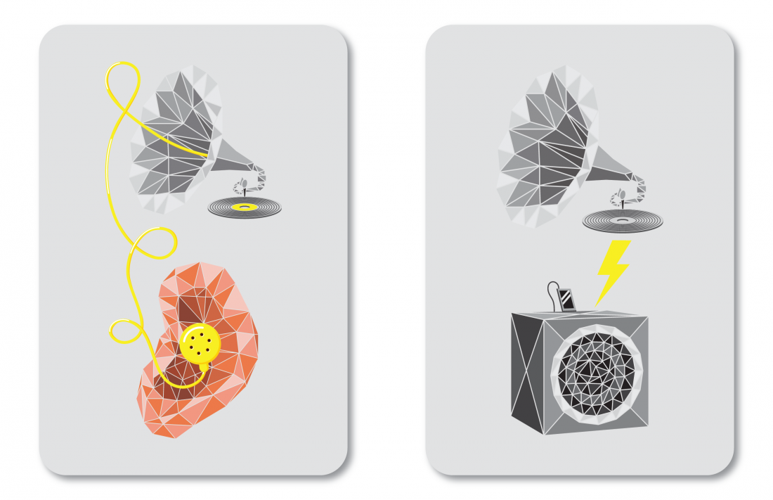
Ad Hoc - This illustration was needed to accompany an article about a new music website in which the founders embody not only the digital, but also the physical collector culture. I decided on a direction of uniting the old with the new, hence the gramophone graphic paired with the headphones, earbud and speaker.
Supercar Illustration / Jan 2012 Nylon Guys / BBB Internship Project
Supercar Illustration / Jan 2012 Nylon Guys / BBB Internship Project
Supercar Illustration / Jan 2012 Nylon Guys / BBB Internship Project
Analog-Digital Music Illustration / Nylon Guys / BBB Internship Project
Analog-Digital Music Illustration Concepts / Nylon Guys / BBB Internship Project
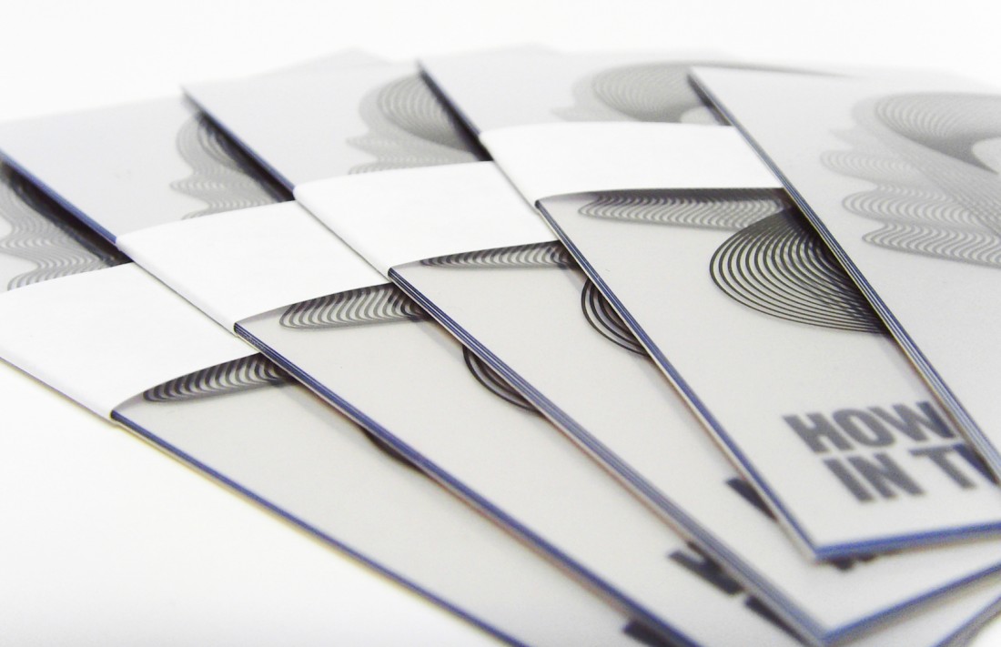
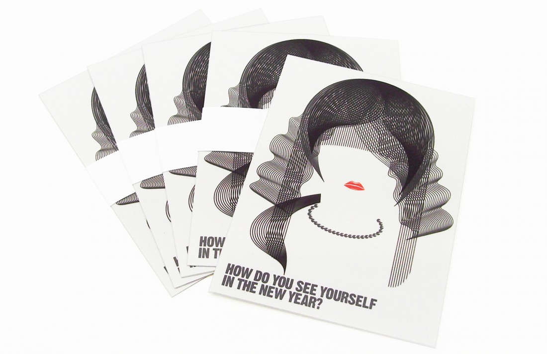
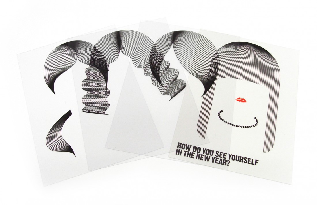
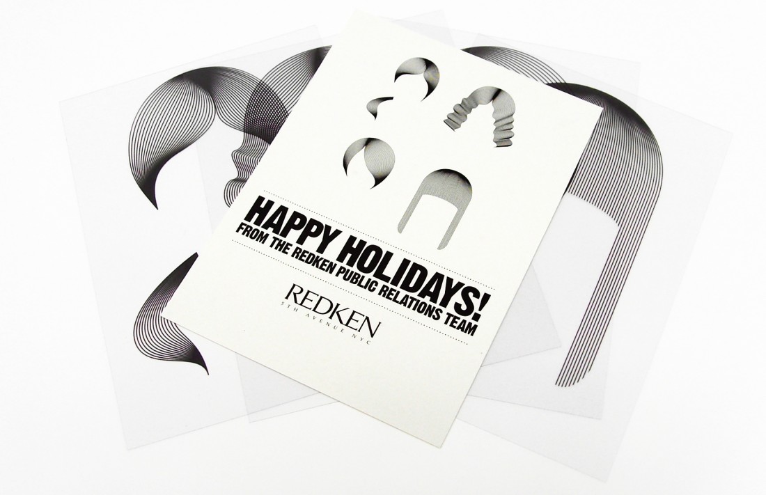
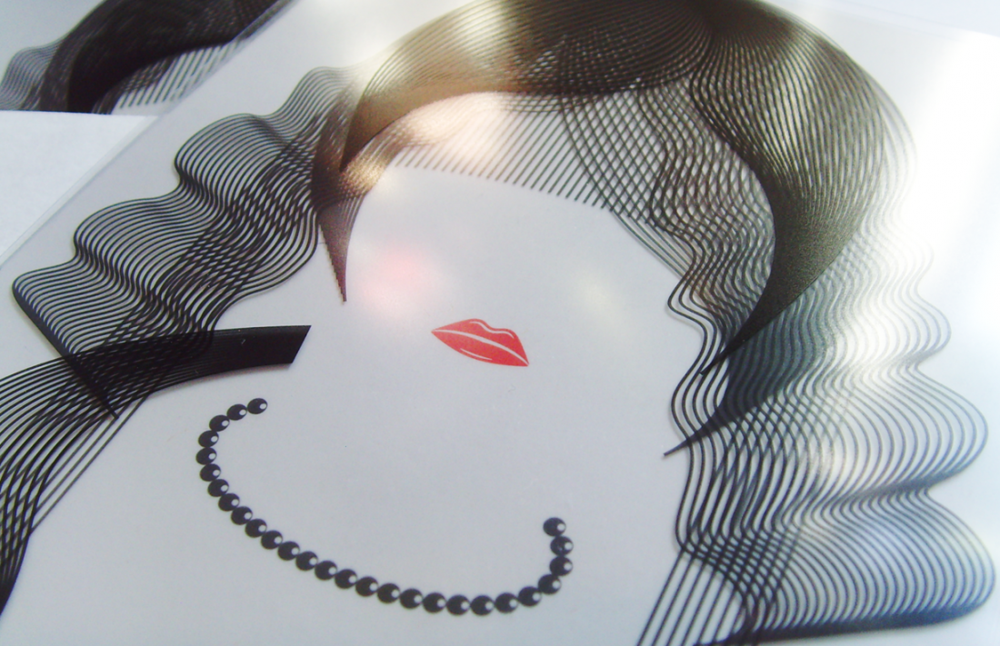
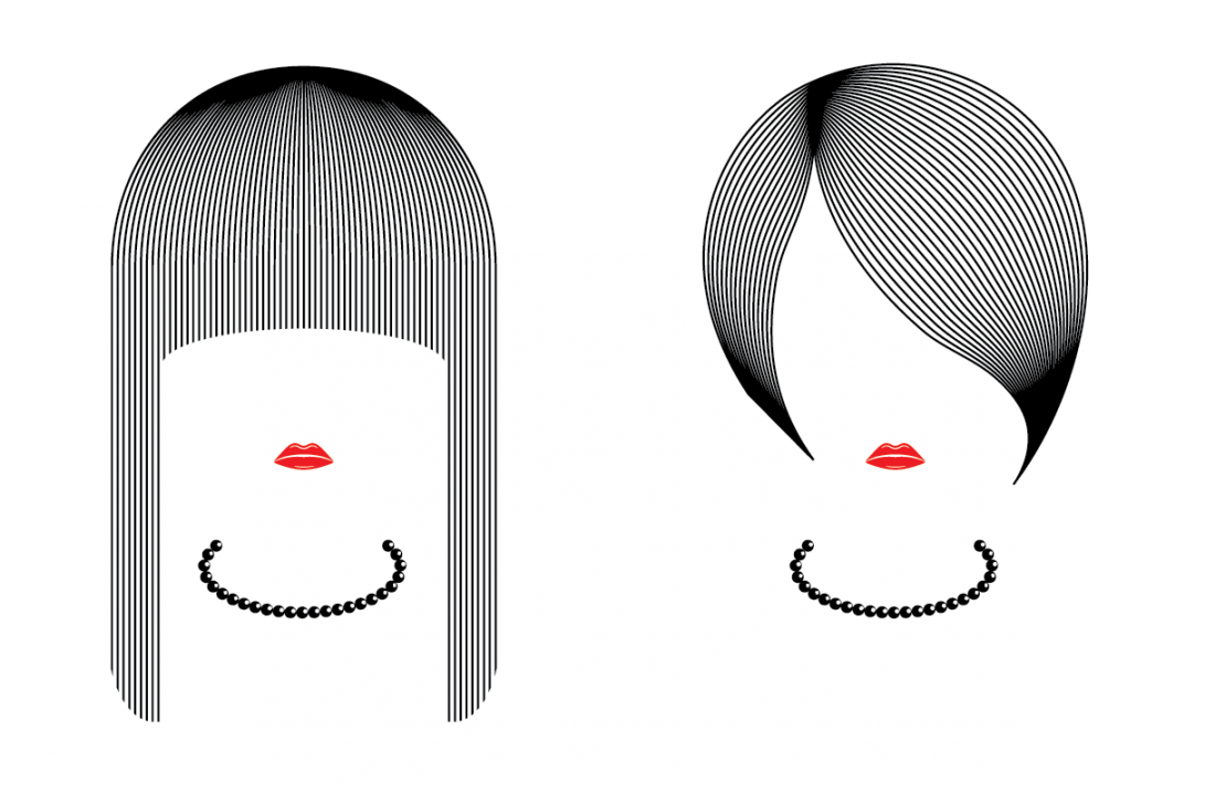
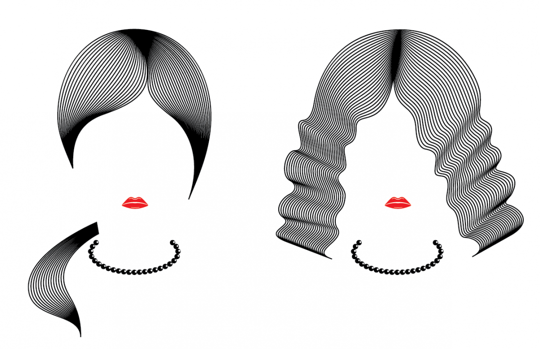
Holiday Card / Redken
Boy Burns Barn Internship Project
For this project, the client wanted a unique design, something other than the standard half fold paper card. Because Redken was the client, the target direction was focused toward hairstyles, fashion, runway, photo shoots, etc.. The use of a secondary material to paper was a must, so acetate was chosen because of its clarity. This material encouraged overlapping and layering which we thought worked into the project theme nicely.
The card is made up of 5 separate sheets. There are 4 different hairstyle designs which engages the end recipient and the slogan 'How do you see yourself in the New Year?' encourages them to choose their favorite look.
Hairstyle Illustrations on Acetate / Redken / BBB Internship Project
Hairstyle Illustrations on Acetate / Redken / BBB Internship Project
Hairstyle Illustrations on Acetate / Redken / BBB Internship Project
Hairstyle Illustrations on Acetate / Redken / BBB Internship Project
Hairstyle Illustrations on Acetate / Redken / BBB Internship Project
Hairstyle Illustrations / Redken / BBB Internship Project
Hairstyle Illustrations / Redken / BBB Internship Project
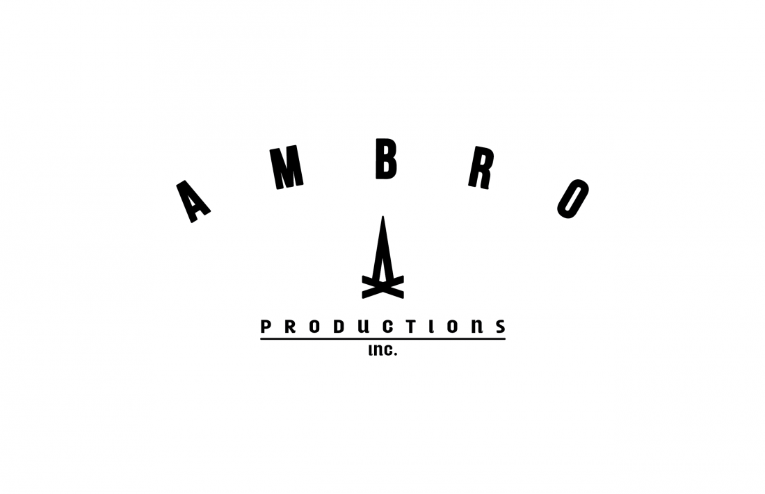
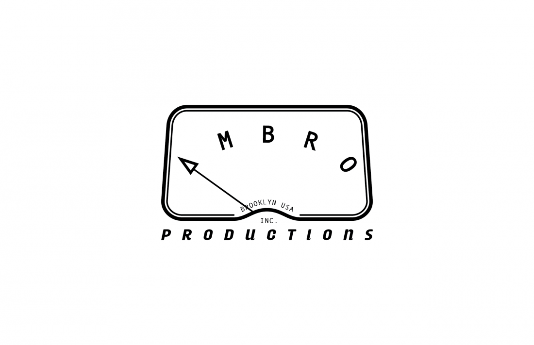
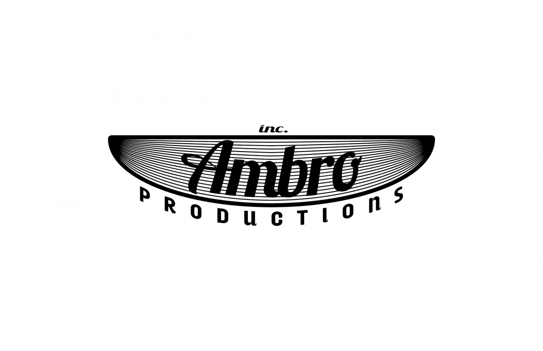
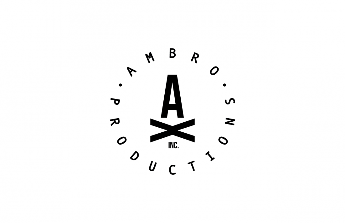
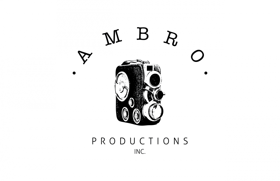
Film Studio Branding / Ambro Productions
Freelance Project
I was approached by an associate of a man named Joachim Back, a film director from Brooklyn. The request was for a logo design for a company called Ambro Productions. Business cards for the producer and director, stationary, letterhead, etc.. were also requested. The project sounded great, definitely within my aesthetic skillet. But after some interment emails, I became impatient and decided to create a few design and send them along hoping something would pique their interest. Unfortunately that did not happen and the project sort of just disappeared. So, after many months of files going unseen, I decided to post some for show. Maybe this will finally bring them around...
Logo Study / Ambro Productions
Inspiration Board / Ambro Productions
Logo Study / Ambro Productions
Logo Study / Ambro Productions
Logo Study / Ambro Productions
Logo Study / Ambro Productions
Logo Study / Ambro Productions
Logo Study / Ambro Productions
Logo Study / Ambro Productions
Logo Study / Ambro Productions
Logo Study / Ambro Productions
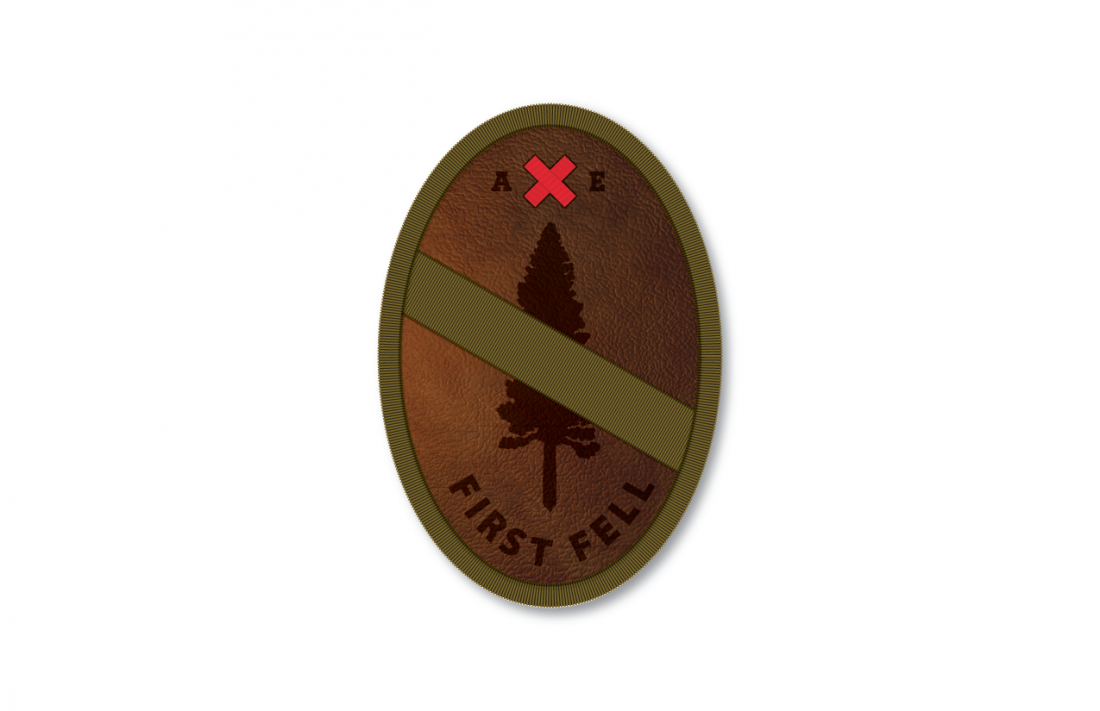
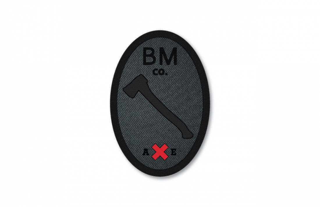
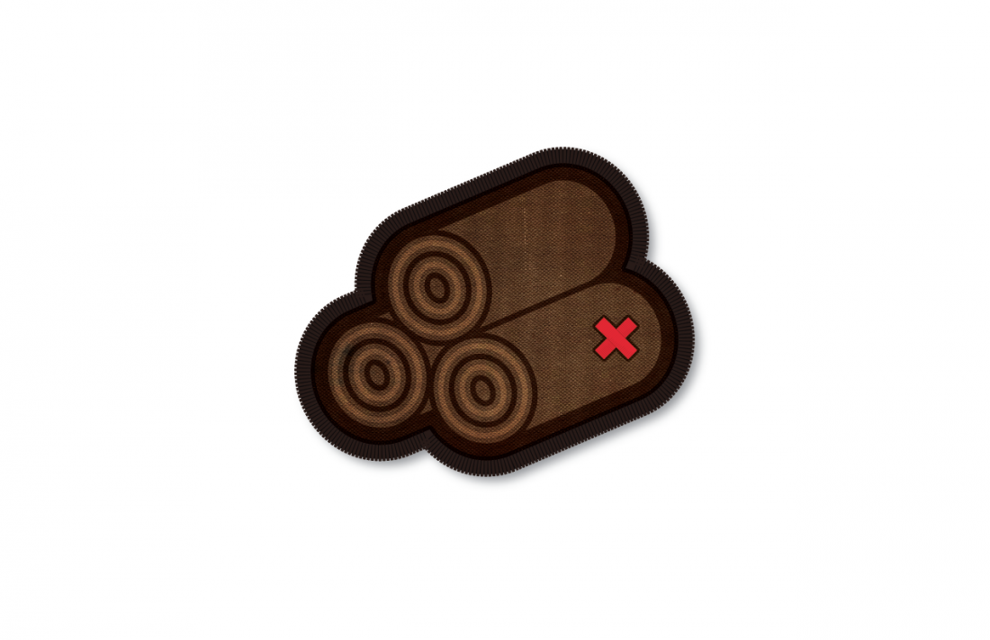
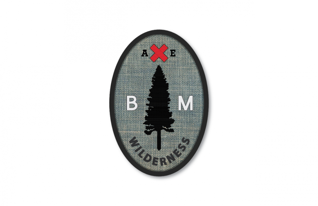
Accessories / Best Made Co.
Freelance Project
During my internship at Best Made, conversations arose about new badge designs. Immediately my interests were had and I ended up putting a few ideas together. Some of these badge concepts revolve around recycled materials such as used denim, leather or felt. The idea was to use these materials as the primary substrate for which the embroidery and embellishments would be applied. Stitching, branding, dying and etching to name a few.
The concept behind the First Fell badge was the traditional BSOA merit system. To provide an individual with a token of gratitude or reward based on the vigorous act of 'felling' their first tree. Preferably with the Best Made American Felling Axe of course.
Nothing has come of these designs, but when I find some more free time I'll definitely jump back on this project and continue adding on.
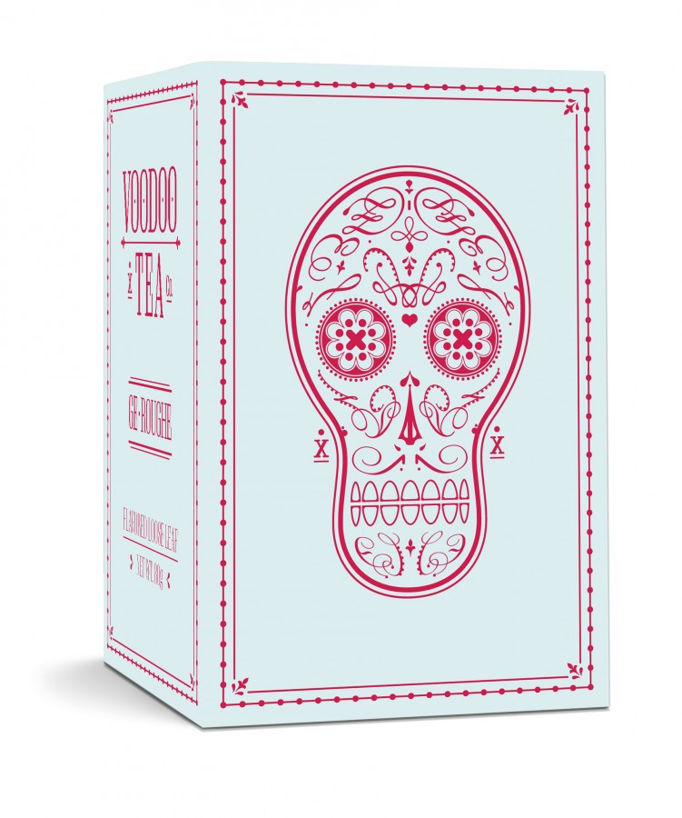
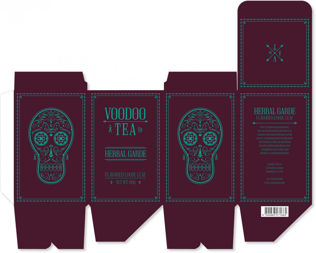
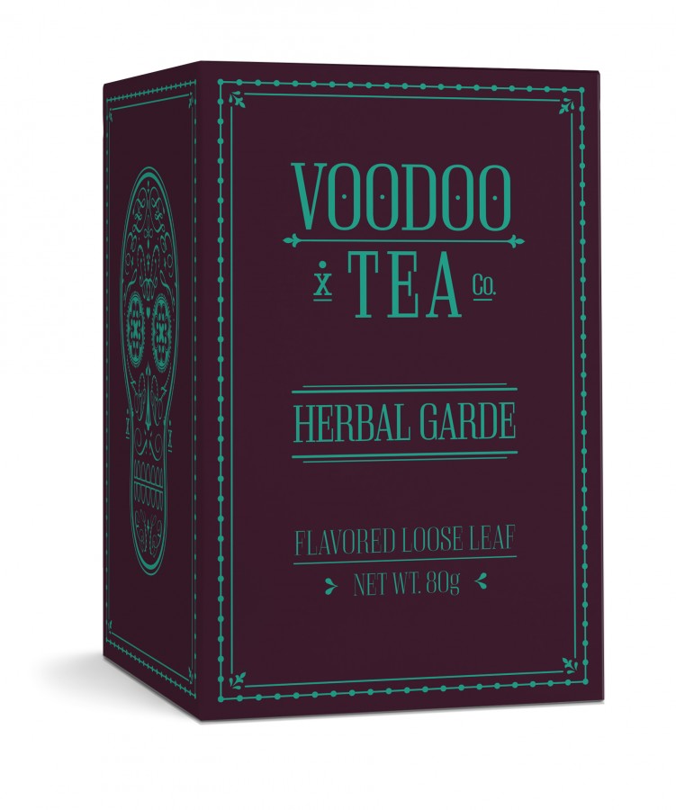
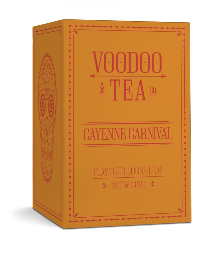
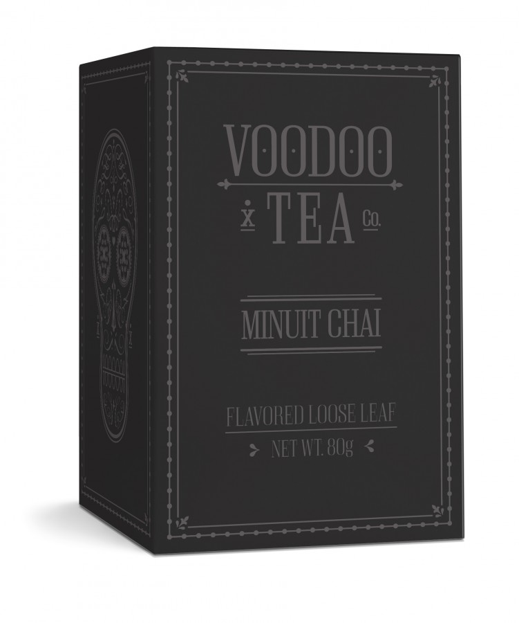
Food & Beverage Branding / Voodoo Tea
Shillington School Project
A new boutique tea company will be offering the finest collection of high quality teas and herbal / fruit tisanes. Located throughout upmarket / gourmet food stores around San Francisco and New York, their range consists of black, green, semi-fermented, favoured, herbal and floral, fruity and organic blends. The client is looking to aim the products at both males and females (age 25-45) with a healthy disposable income. The demographic will appreciate fine wine and fine food and is more likely to pay more for a quality product. These men and women shop regularly at gourmet delicatessens or such places as Dean & Deluca or Whole Foods. They appreciate style / design and are very particular about the type of teas they purchase.
Ge-Roughe Flavor / Voodoo Tea / School Project
Three Brandmarks / Voodoo Tea / School Project
Packaging Die Cut / Voodoo Tea / School Project
Herbal Garde Flavor / Voodoo Tea / School Project
Green Esplandade Flavor / Voodoo Tea / School Project
Cayenne Carnival Flavor / Voodoo Tea / School Project
White Lapin Flavor / Voodoo Tea / School Project
Minuit Chai Flavor / Voodoo Tea / School Project
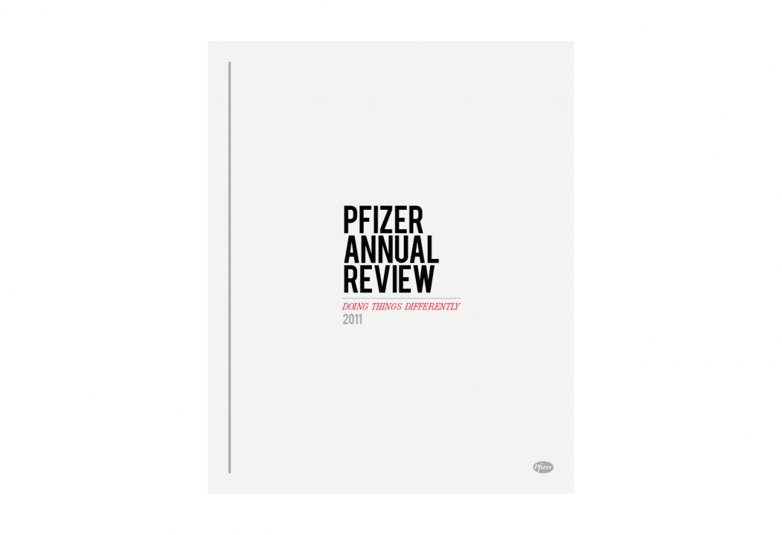
Annual Report Layout / Pfizer
Shillington School Project
Design and layout the (partial) content of the upcoming Pfizer Annual Report. The client (the world’s largest research-based pharmaceutical company), has specified that their shareholders appreciate clean, readable text and are accustomed to stylish corporate design. However, the title of the report “Doing Things Differently” should be used as inspiration, a new take on the corporate look.
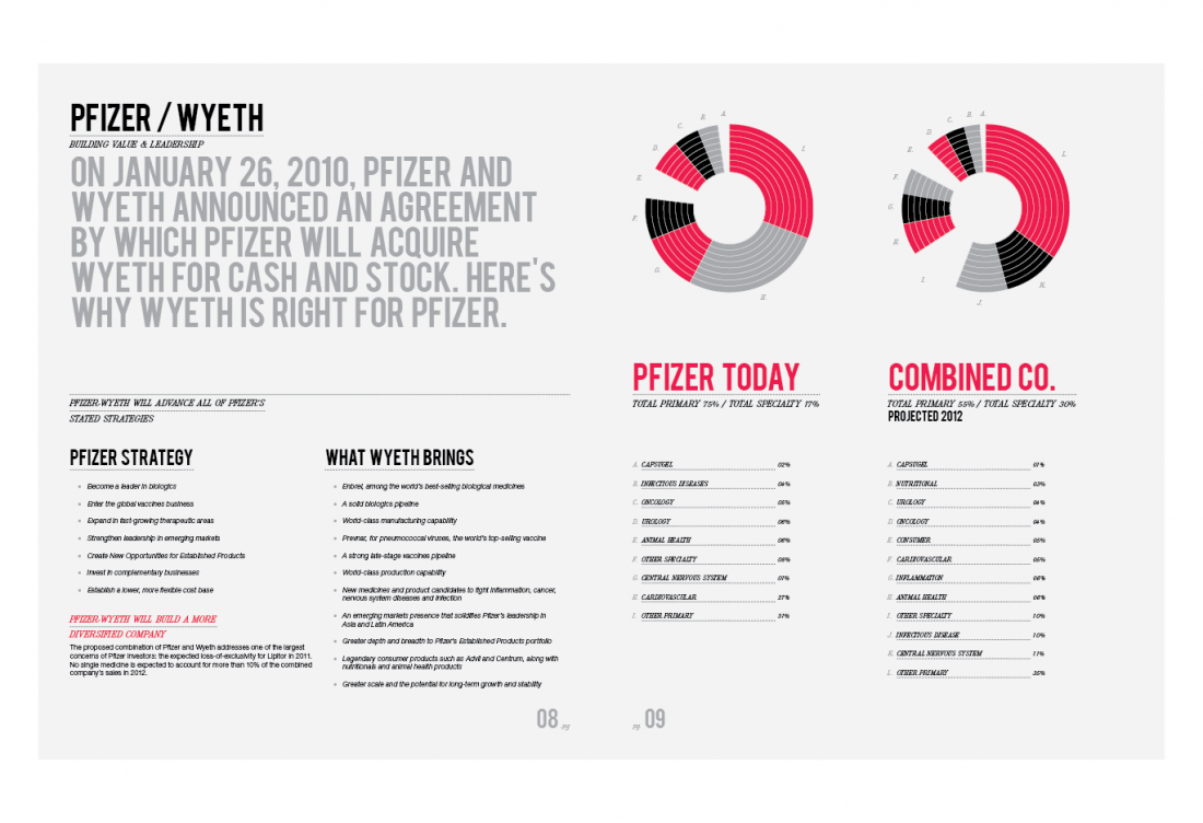
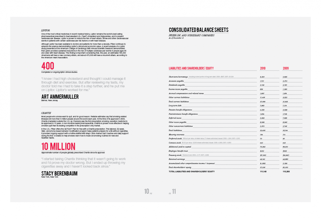
Annual Report Cover / Pfizer / School Project
Annual Report Layout / Pfizer / School Project
Annual Report Layout / Pfizer / School Project
Annual Report Layout / Pfizer / School Project
Annual Report Layout / Pfizer / School Project
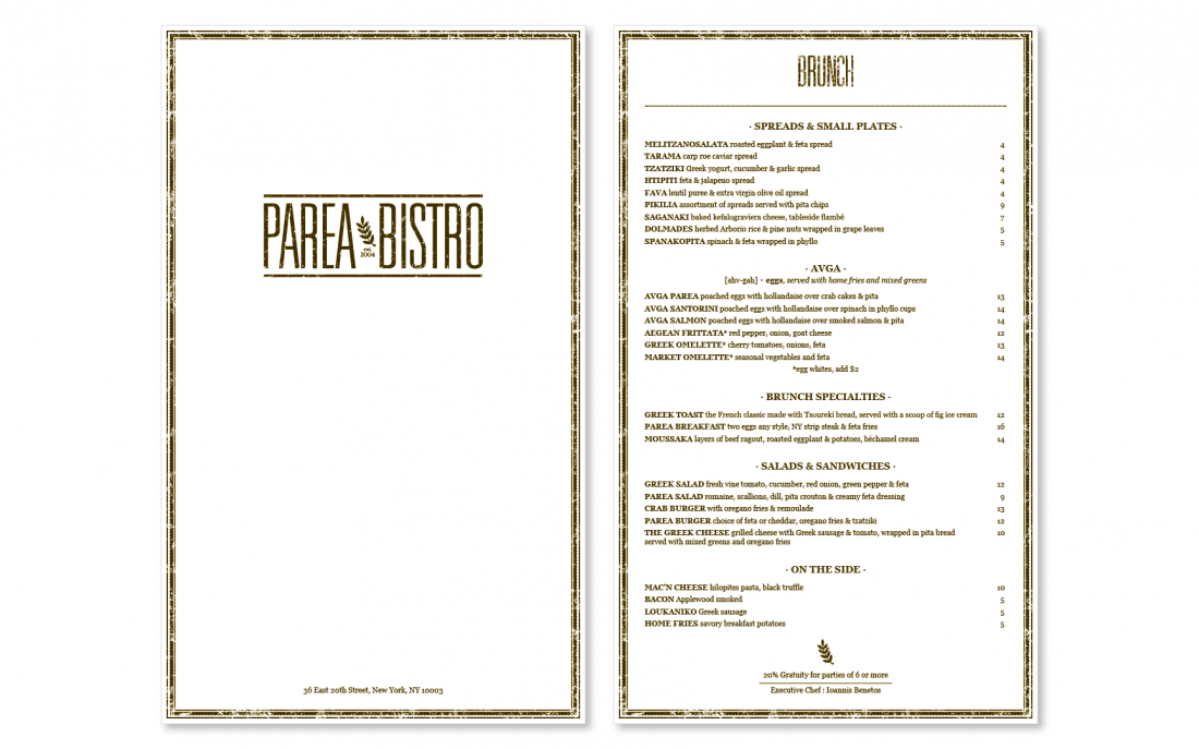
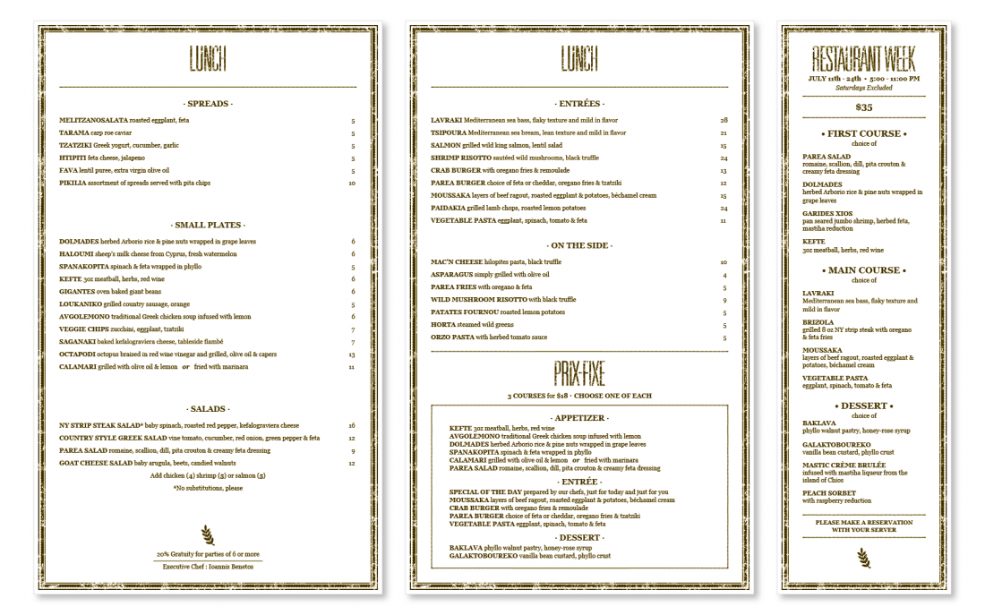
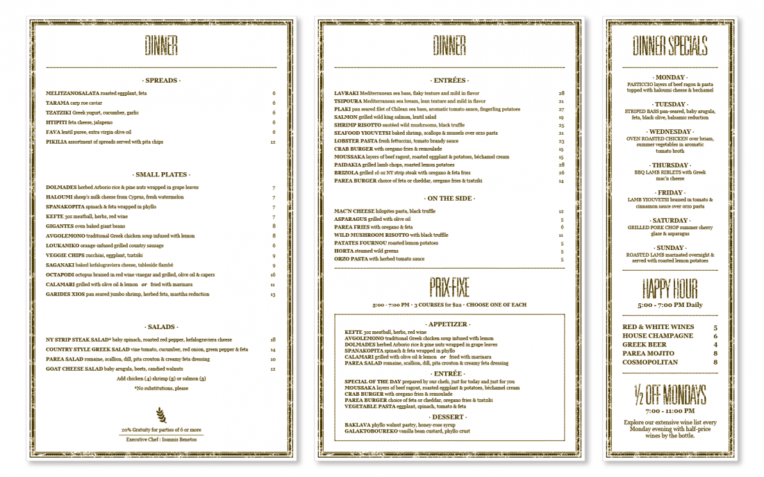
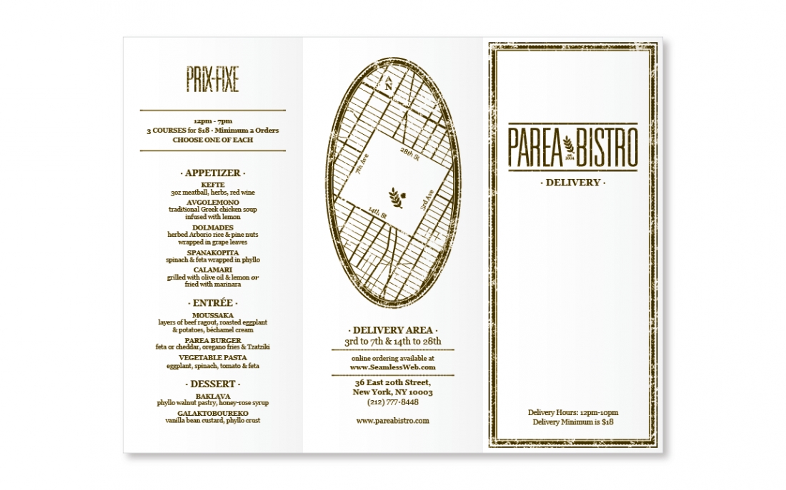
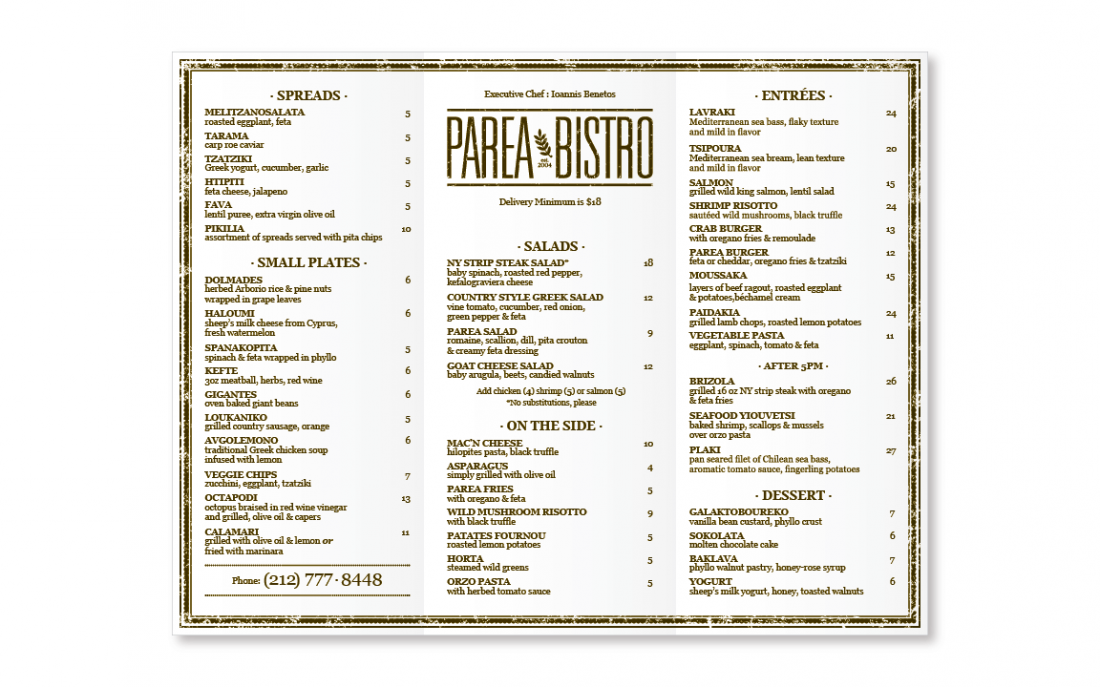
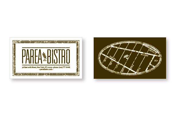
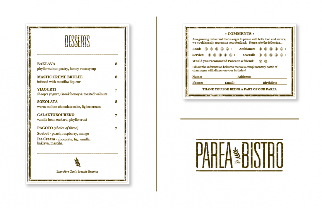
Restaurant Branding / Parea Bistro
Freelance Project
For this project, the client asked for a mini rebranding of the Parea Bistro restaurant located in NYC. This included a new logo design, a set of new menus and some other odds and ends. I started with the logo design and after some early feedback I had a pretty good understanding of what the client was looking for. I quickly translated the style of the choosen logo design into the menu layouts and the rest of the items.
Brunch Menu Cover and Layout / Parea Bistro
Lunch Menu Layout / Parea Bistro
Dinner Menu Layout / Parea Bistro
Delivery Menu Layout / Parea Bistro
Delivery Menu Layout / Parea Bistro
Double Sided Business Card / Parea Bistro
Desert Menu and Comment Card Layout / Parea Bistro
Logo Concept / Parea Bistro
Logo Concept / Parea Bistro
Logo Concept / Parea Bistro
Logo Concept / Parea Bistro
Logo Concept / Parea Bistro
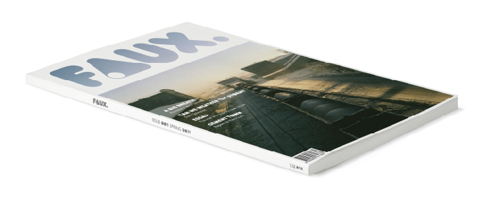
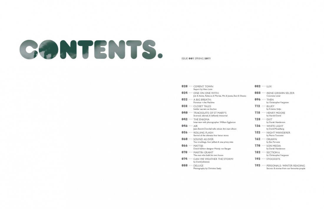
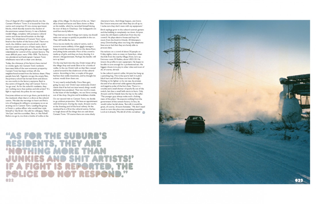
Magazine Layout / Faux Issue 001
Shillington School Project
A biannual international publication distributed in Australia and the UK (other international destinations coming soon). More than a glossy arts tabloid, it is a definitive resource that will seek out all those talented individuals and collectives who actually make a positive contribution to our culture. The ones with a passion for art, architecture, fashion, photography, music, film and design... These are the kind of people who inspire this magazine.
Magazine Cover Design / School Project
Magazine Layout Design / School Project
Magazine Layout Design / School Project
Magazine Layout Design / School Project
Magazine Brandmark / School Project
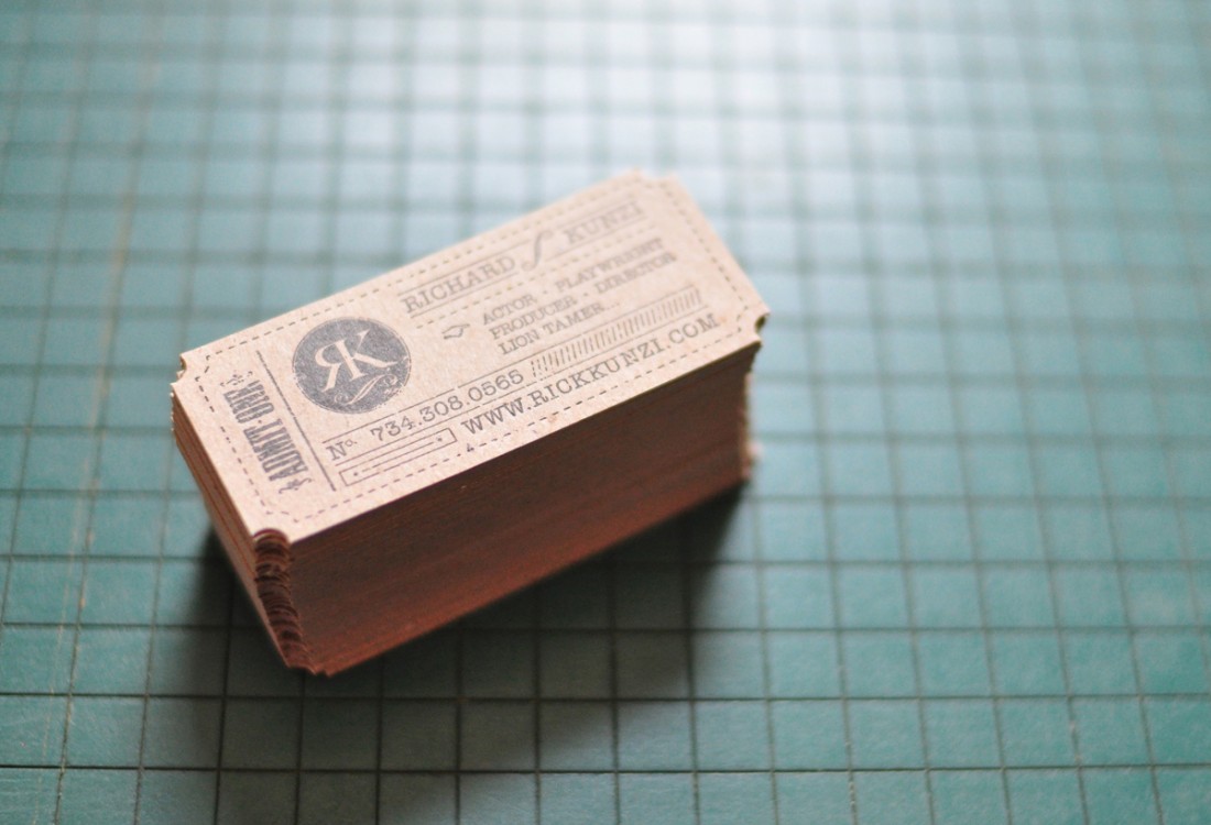
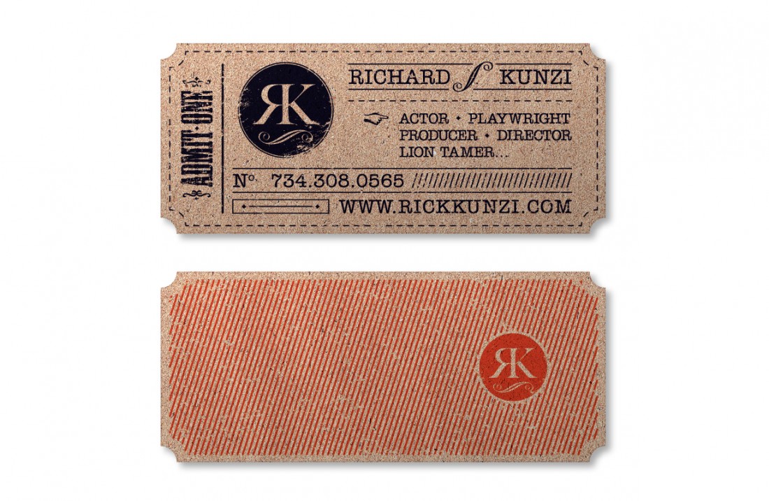
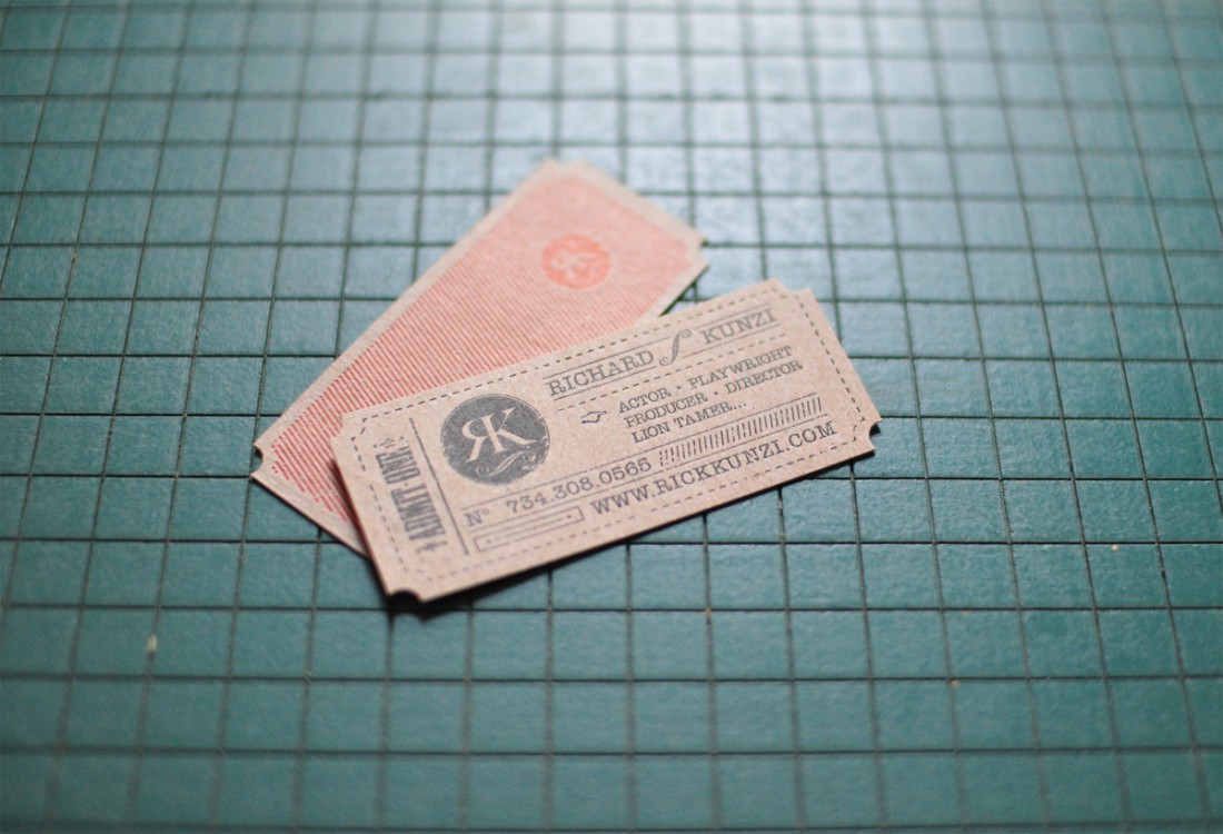
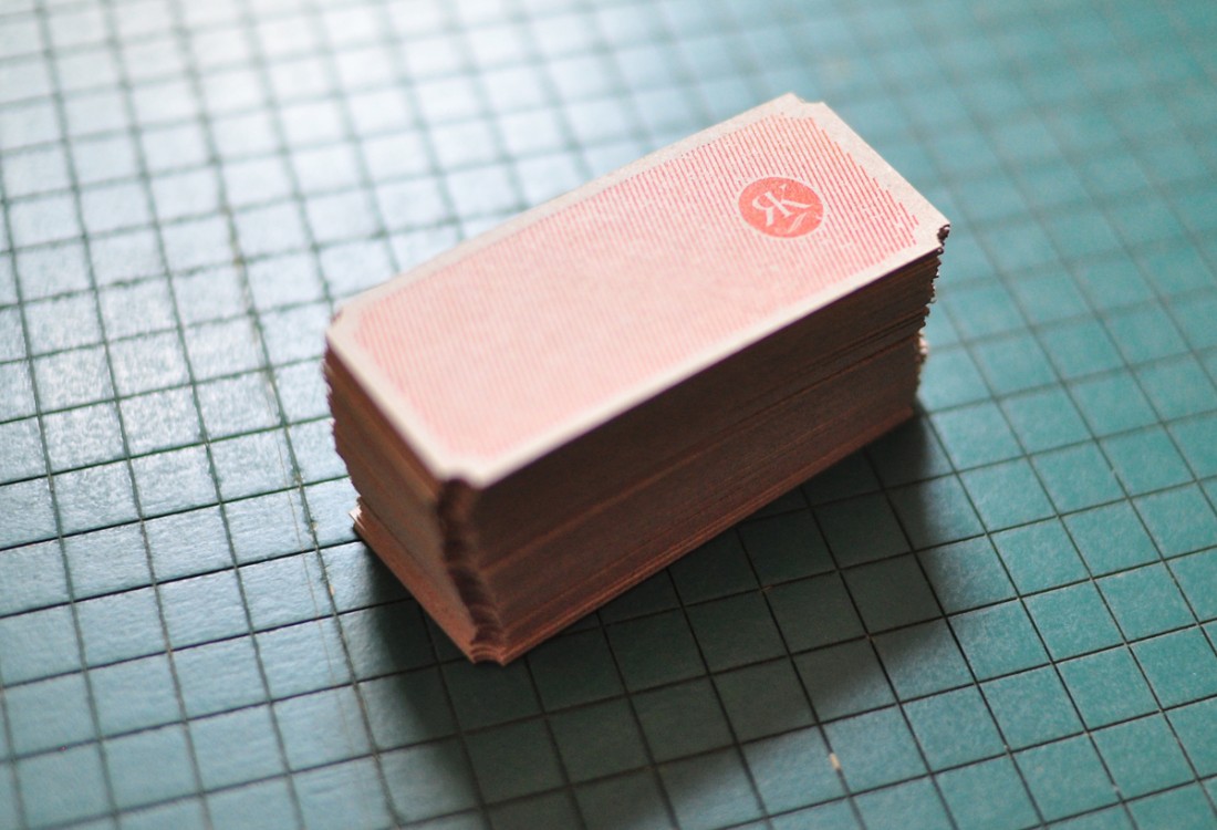
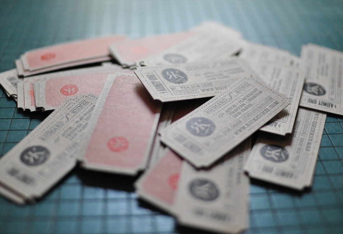
Business Card / Theater Artist
Freelance Project
The client for this project is an actor, writer and director in the theater industry. With a great sense of style and an equally great sense of humor, he envisioned his business card standing out from the rest. The inspiration, quickly decided upon, was a vintage theater ticket. This card is double side letterpress on 24pt repurposed chipboard. For the finishing touch, a hole punch was used to invert the corners to mimic the ticket appeal.
Double Sided Letterpress Business Card / Rick Kunzi
Business Card Mockup / Rick Kunzi
Double Sided Letterpress Business Card / Rick Kunzi
Double Sided Letterpress Business Card / Rick Kunzi
Double Sided Letterpress Business Card / Rick Kunzi
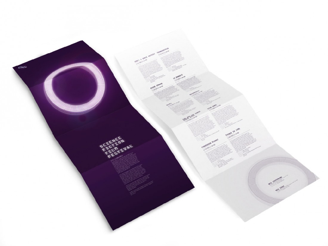
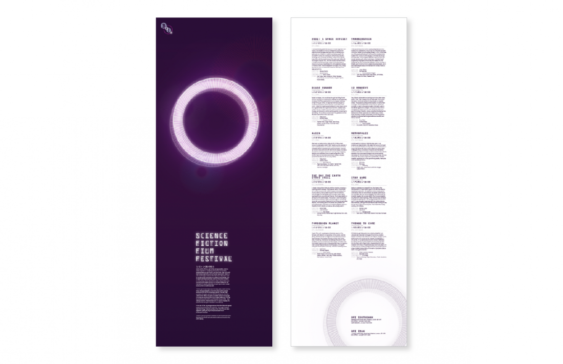
Film Festival Brochure / BFI
Shillington School Project
The British Film Institute (BFI). Their world-renowned archive, cinemas, festivals, films, publications and learning resources are all about visual inspiration. BFI screens over 1,000 films a year, from rare silent comedies to cult movies and archive television screenings. The client requires a single brochure to be designed for a genre screening event. Choice of one of the following: Horror Film / Science Fiction / Anime / The Golden Years of Hollywood. The design style should mirror the genre chosen, however this design will have leanings towards a contemporary design. The demographic is primarily lovers of the moving image. They frequent movie festivals and generally avoid contemporary vomit inducing Hollywood blockbuster offal. The average age bracket is roughly 25 - 65, male and female.
Film Festival Brochure / BFI / School Project
Film Festival Brochure / BFI / School Project
Film Festival Type Package / BFI / School Project
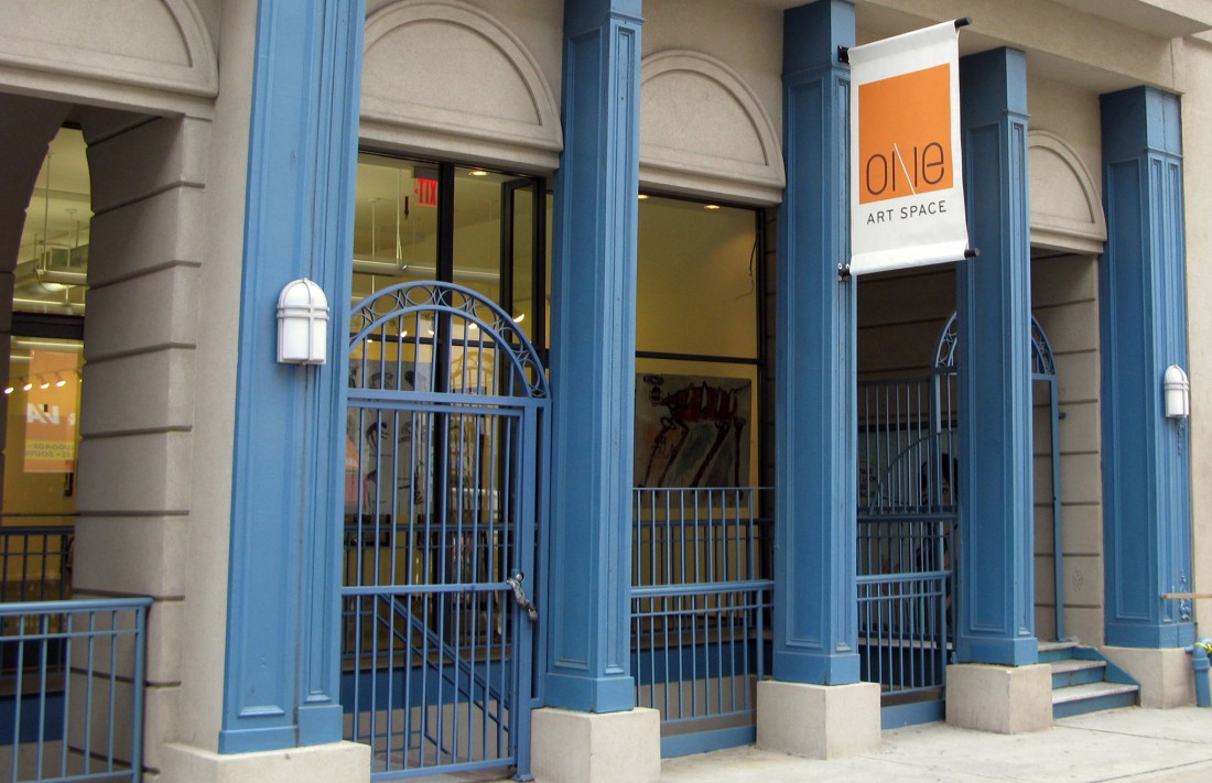
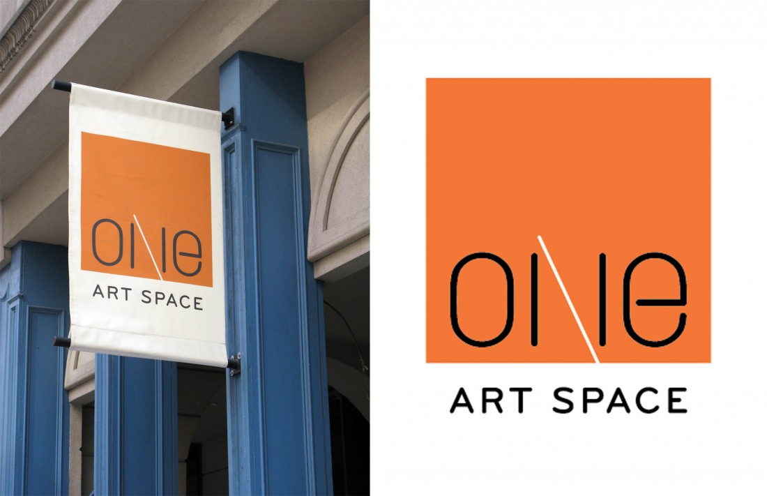
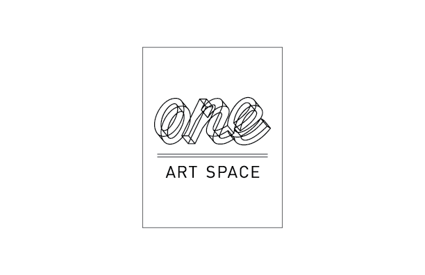
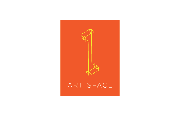
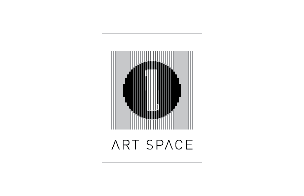
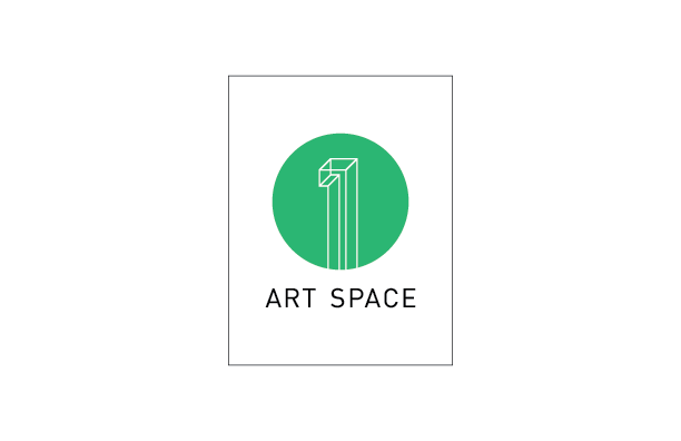
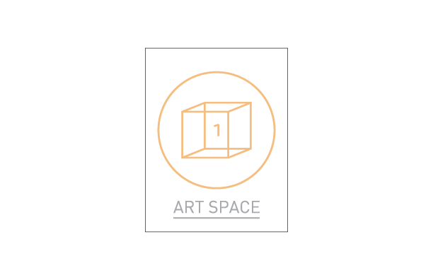
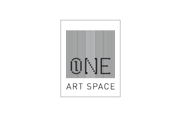
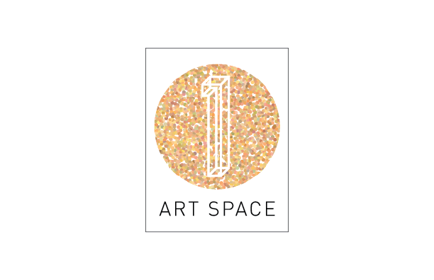
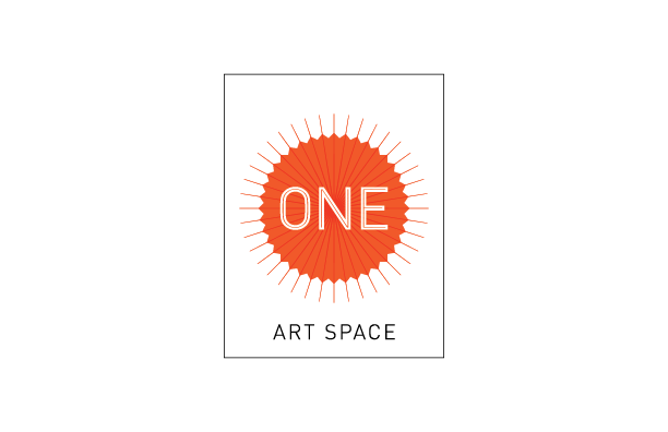
Art Gallery Logo / One Art Space
Freelance Project
The owner of Giella Design Group located in NYC allowed me the opportunity to design the logo for his latest project, One Art Space. The Tribeca gallery seeks to provide local and international, contemporary artists engaged in a wide-range of artistic expression, a space and a targeted audience to showcase their art. By the time I received the project, there had already been some parameters established. The direction was to create a minimalist design focusing around the word or number One.
FInal Logo Design / One Art Space
FInal Logo Design / One Art Space
Logo Concept / One Art Space
Logo Concept / One Art Space
Logo Concept / One Art Space
Logo Concept / One Art Space
Logo Concept / One Art Space
Logo Concept / One Art Space
Logo Concept / One Art Space
Logo Concept / One Art Space
Logo Concept / One Art Space
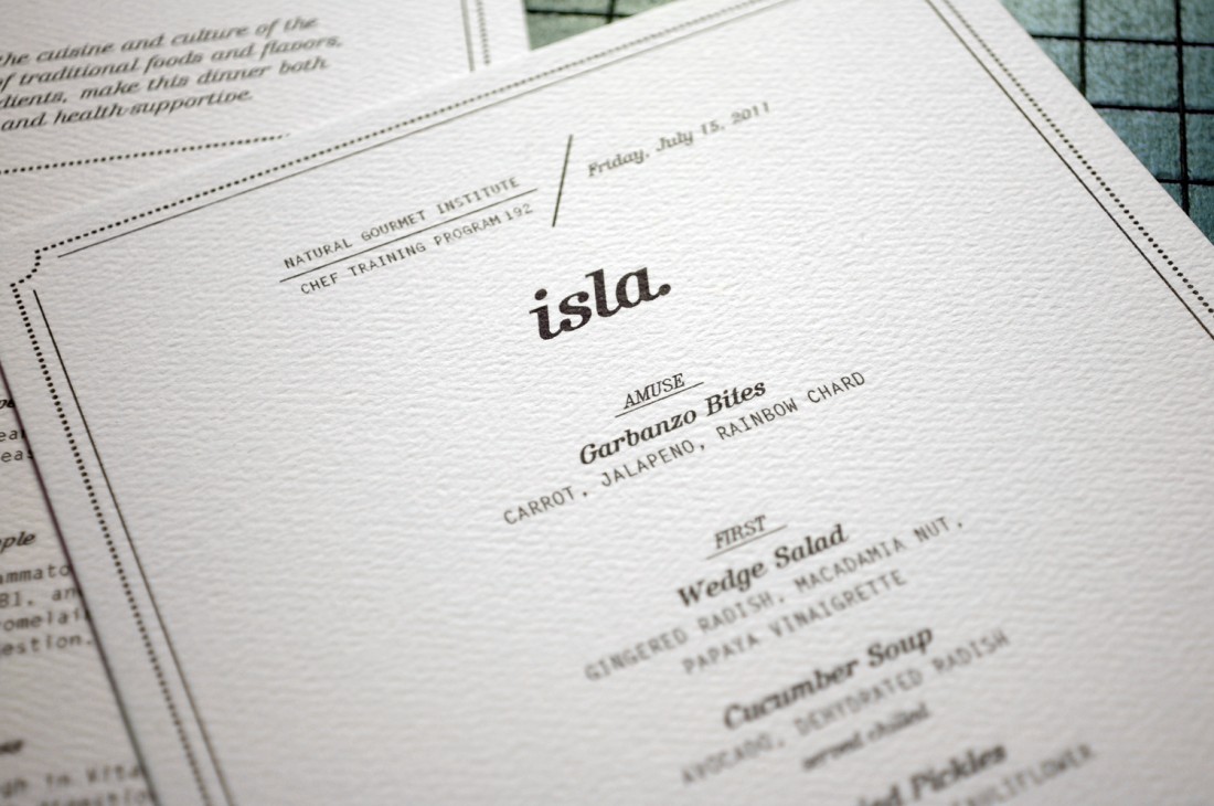
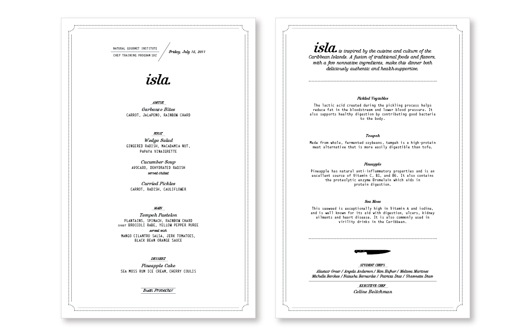
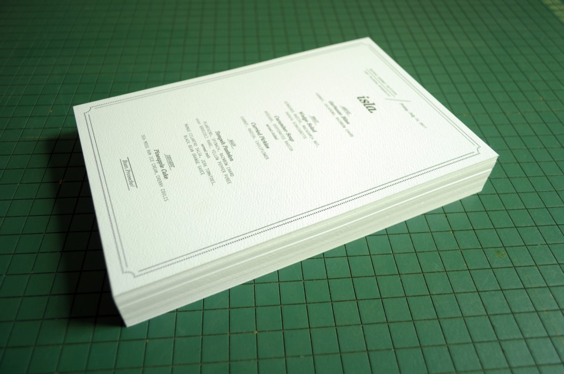
Dinner Menu / Natural Gourmet Institute
Freelance Project
This project was created for the graduating class of the Natural Gourmet Institute (NGI), Chef Training Program 192. Located in NYC, NGI is the leader in health-supportive culinary arts and theory. The theme of this dinner was Caribbean, however the client did not want the menu to use said influence. Cost was the primary driver in this project, however intelligent compromise allowed for the purchasing of a heavy weight textured paper. After using just a standard inkjet printer, the menu's perceived value was increased and is slightly suggestive of a letterpressing.
Double Sided Dinner Menu / Natural Gourmet Institute
Double Sided Dinner Menu / Natural Gourmet Institute
Double Sided Dinner Menu / Natural Gourmet Institute
Double Sided Dinner Menu / Natural Gourmet Institute
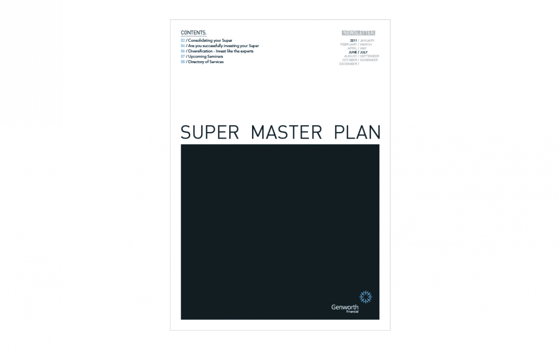
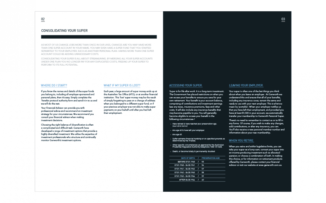
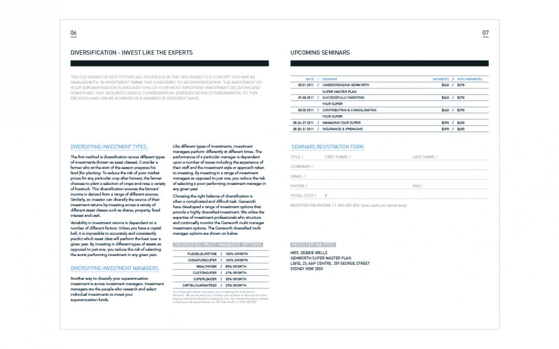
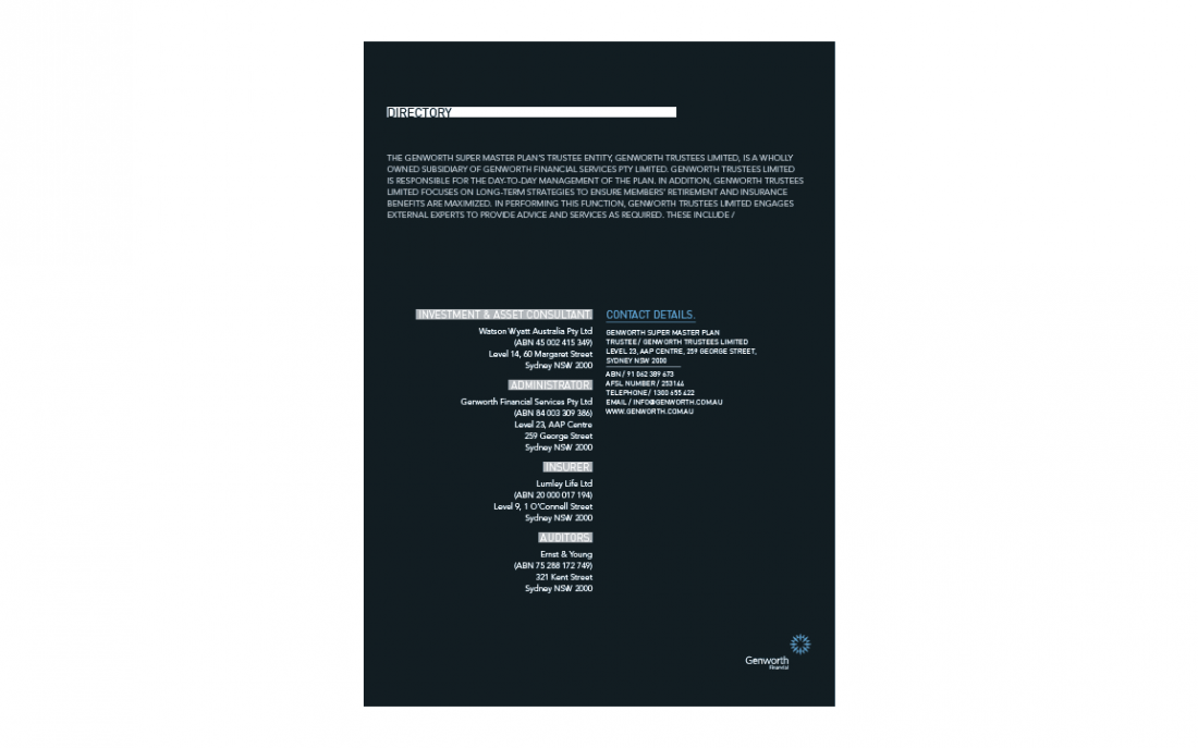
Corporate Newsletter Layout / Genworth Financial
Shillington School Project
Genworth Financial is the leading Lenders Mortgage Insurance (LMI) provider in Australia and New Zealand. Genworth have recently expanded their product portfolio to include superannuation fund management and insurance. They have asked for an eight page newsletter that is produced bimonthly. The client has specified that their shareholders appreciate clean, readable text and are accustomed to stylish corporate design.
Corporate Newsletter Cover / Genworth Financial / School Project
Corporate Newsletter Layout / Genworth Financial / School Project
Corporate Newsletter Layout / Genworth Financial / School Project
Corporate Newsletter Layout / Genworth Financial / School Project
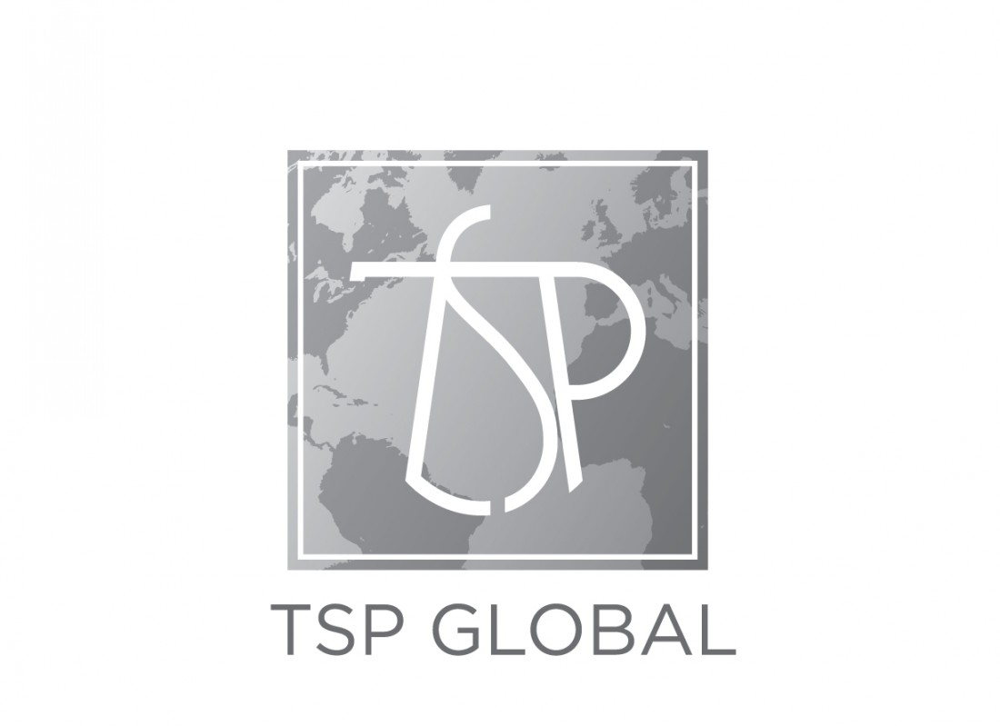
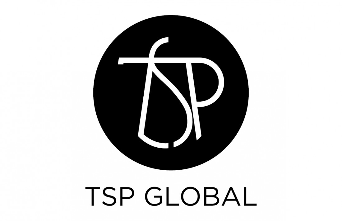
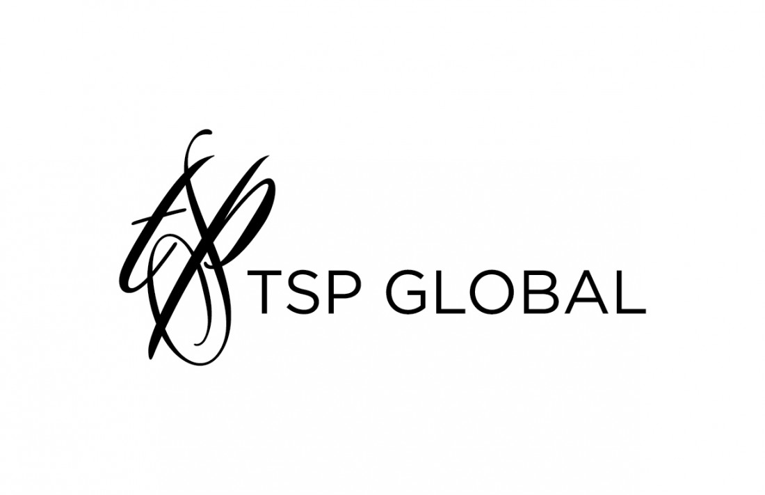
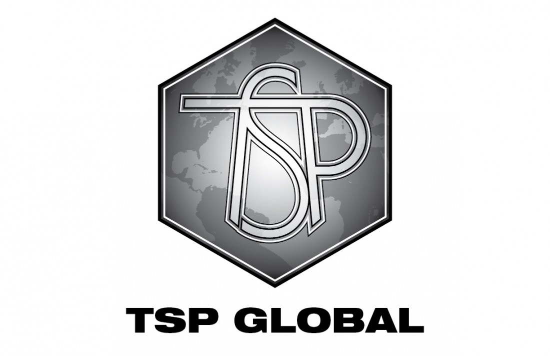
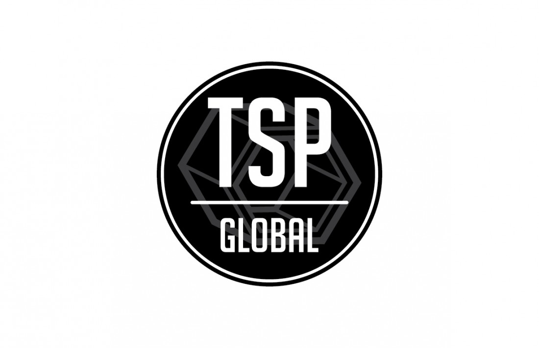
Corporate Logo / TSP Global
Freelance Project
I was approached by a friend of mine for this project. His company was interested in redesigning the logo of a recently acquired international business. Unfortunately, the project was retracted before I really had a chance to sink my teeth into it. I'm really only showing this project because I'm hoping for another opportunity designing a corporate identity.
Corporate Logo Concept / TSP Global
Corporate Logo Concept / TSP Global
Corporate Logo Concept / TSP Global
Corporate Logo Concept / TSP Global
Corporate Logo Concept / TSP Global
Corporate Logo Concept / TSP Global
The Odds & Ends
Mixed Projects
This grouping is sort of the odds and ends of different projects, encompassing small and/or personal assignments each not large enough fulfill their own section. That aside, these are some of the fun ones.
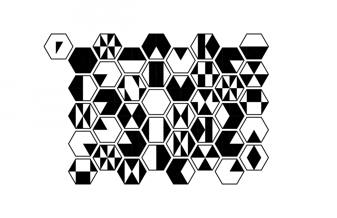
Mountain Range / Graphic Exercise
Animal Graphic Studies / The Grey Barn / BBB Internship Project
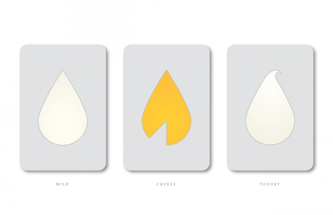
Dairy Graphic Studies / The Grey Barn / BBB Internship Project
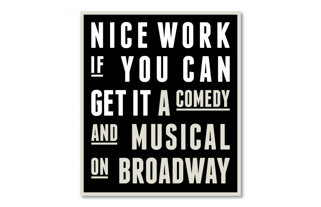
Graphic Study / Nice Work The Musical / BBB Internship Project
Graphic Studies / Nice Work The Musical / BBB Internship Project
Graphic Study / Tisch / BBB Internship Project
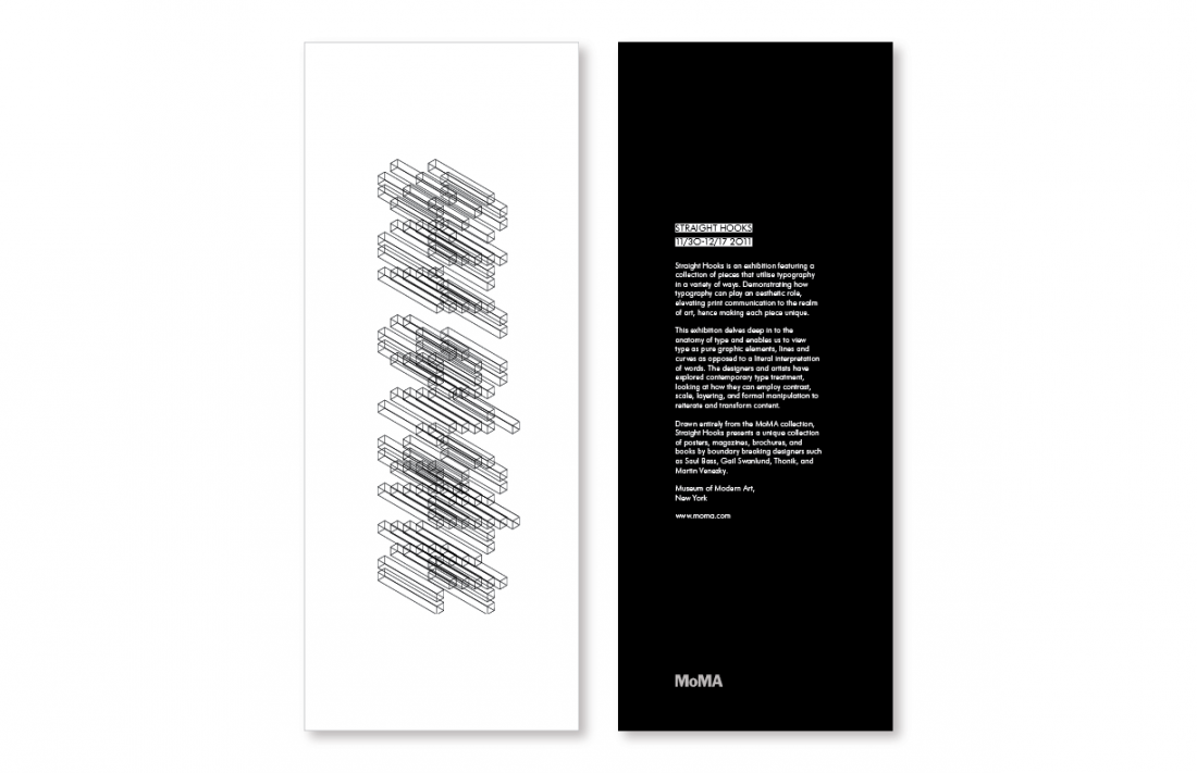
Museum Exhibition Flyer / Straight Hooks / School Project
Bicycles for Sale Sign / MyNeighborBruce
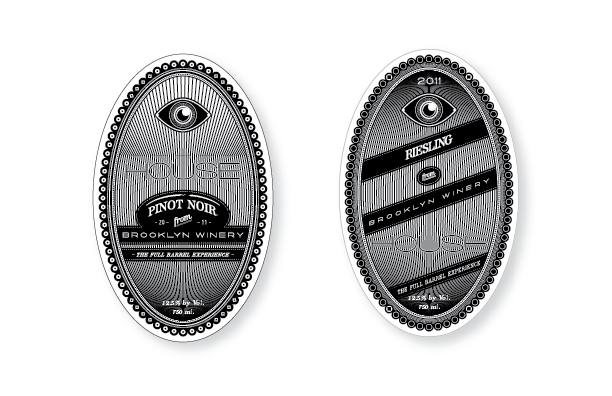
Wine Label Concepts / Brooklyn Winery
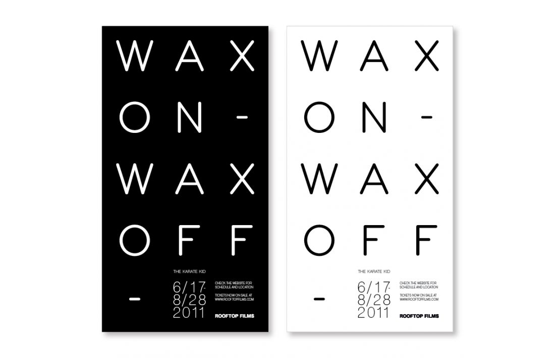
Film Festival Event Ad / Rooftop Films / School Project
Tuque & Stache Logo / School Project
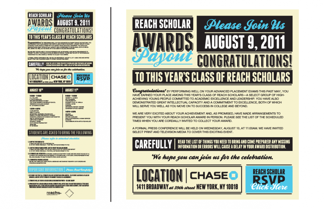
Email Banner / REACH Rewarding Achievement
Stylized Quote / MyNeighborBruce
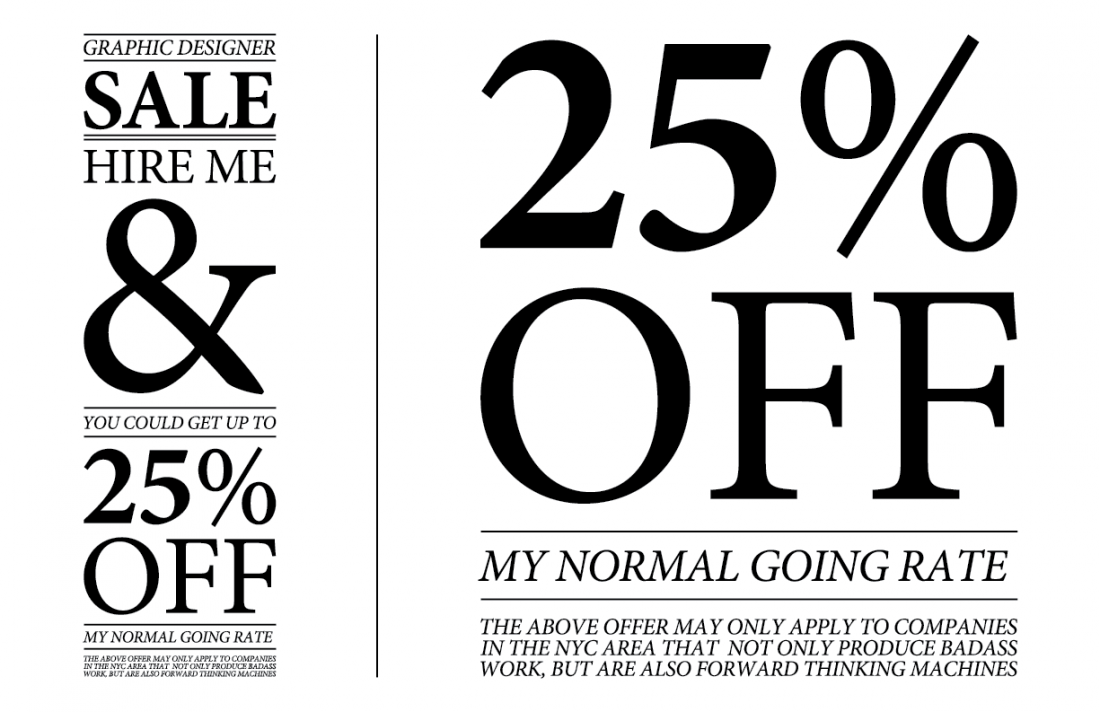
Graphic Designer for Sale / Advertising Spoof
Stylized Quote / MyNeighborBruce
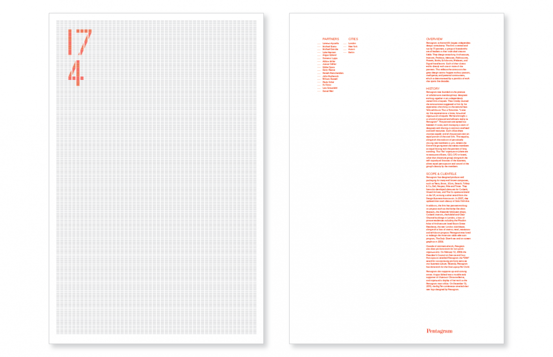
Double Sided Poster / Pentagram History / School Project
A factory made of clouds that makes clouds...how fun!
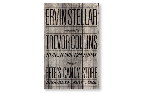
Concert Poster for Web / Ervin Stellar
Concert Poster for Web / Ervin Stellar
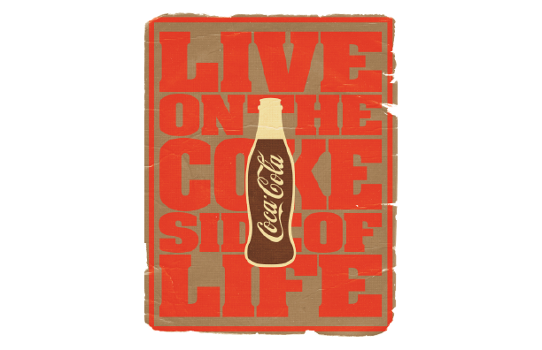
Advertisement / Vintage Coke / School Project